

Wasabi Graphics
Designing interfaces: experiences that inspire action.
Every interface I design is guided by usability, storytelling, and a passion for impactful digital experiences.

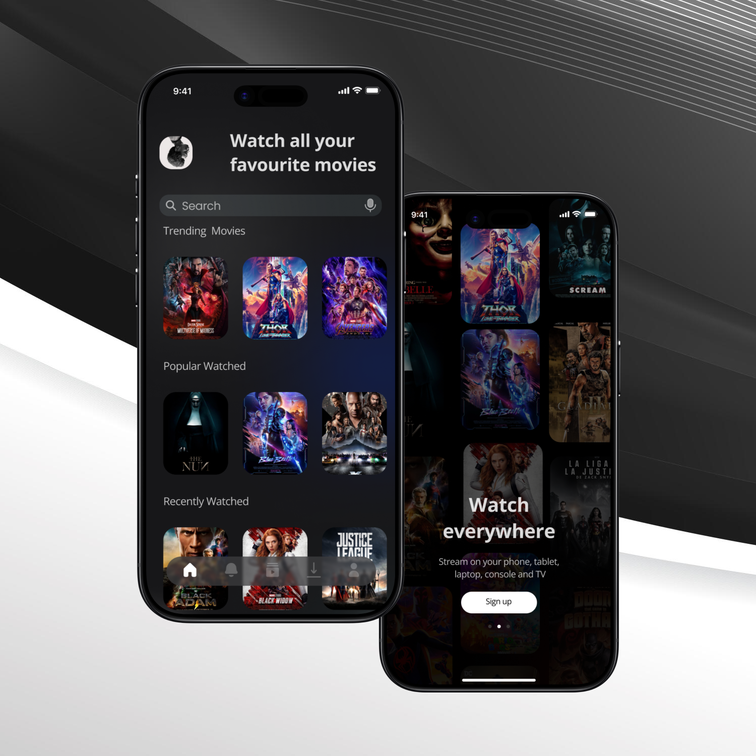
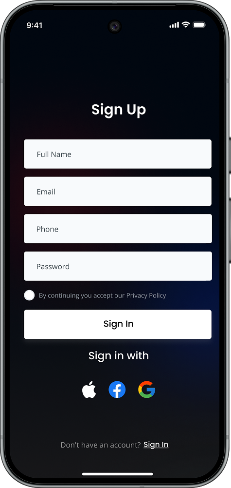
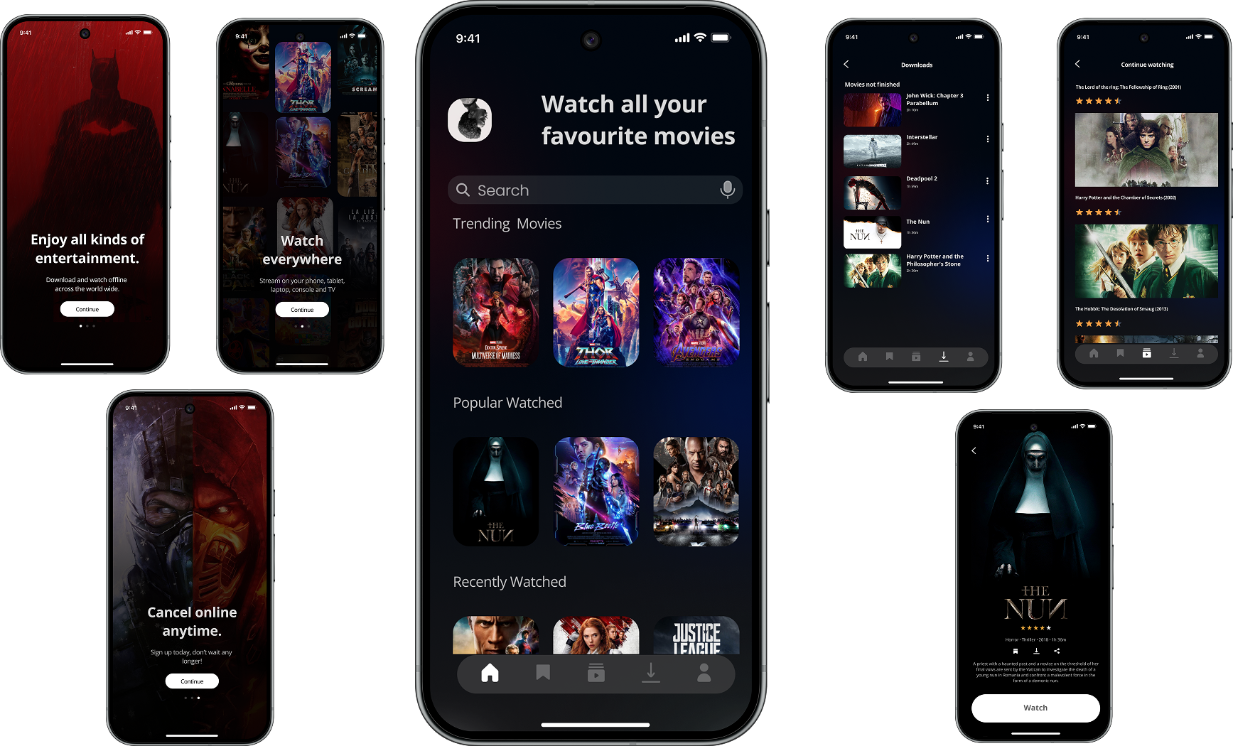
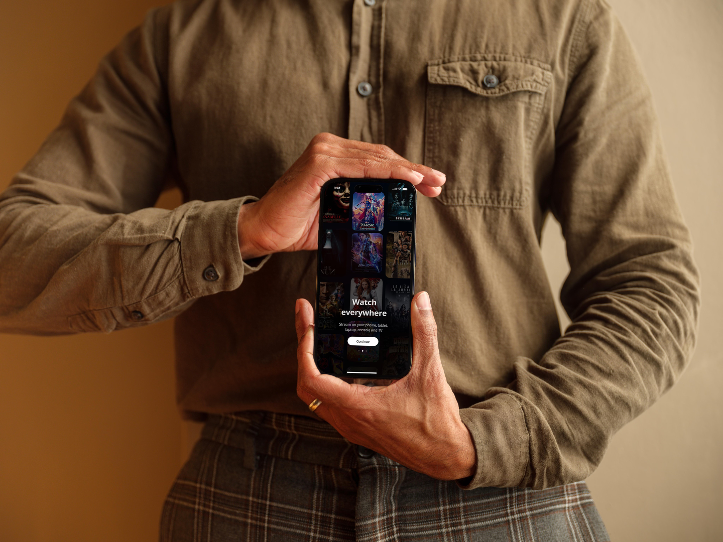
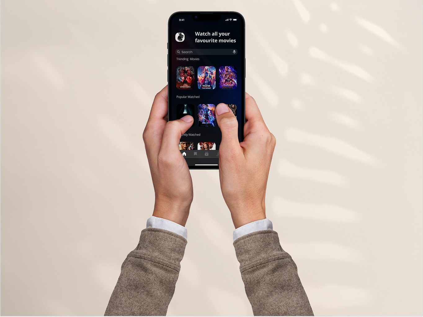
MyMovies is a movie-only, distraction-free app that helps users discover, save, download, and manage movies in a single, simple place. Unlike mainstream streaming platforms, MyMovies focuses only on films — no TV series, no noisy feeds — giving users fast discovery, clear favourites, reliable offline downloads, and an easy “Continue Watching” experience.
Design a lightweight, cinematic mobile app that lets users find movies quickly, save and resume films they care about, and download content for offline viewing — all in a minimal, movie-only environment that reduces decision fatigue.
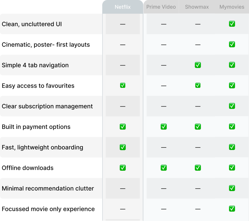
Mainstream streaming platforms often mix movies and episodic content, present cluttered interfaces, and bury core actions (like downloads or saved lists). Users get overwhelmed, forget recommended titles, and struggle to resume partially watched films. MyMovies addresses these pain points by being movie-only and focusing on fast, clear interactions around search, favourites, offline access, and resuming playback.
Design process
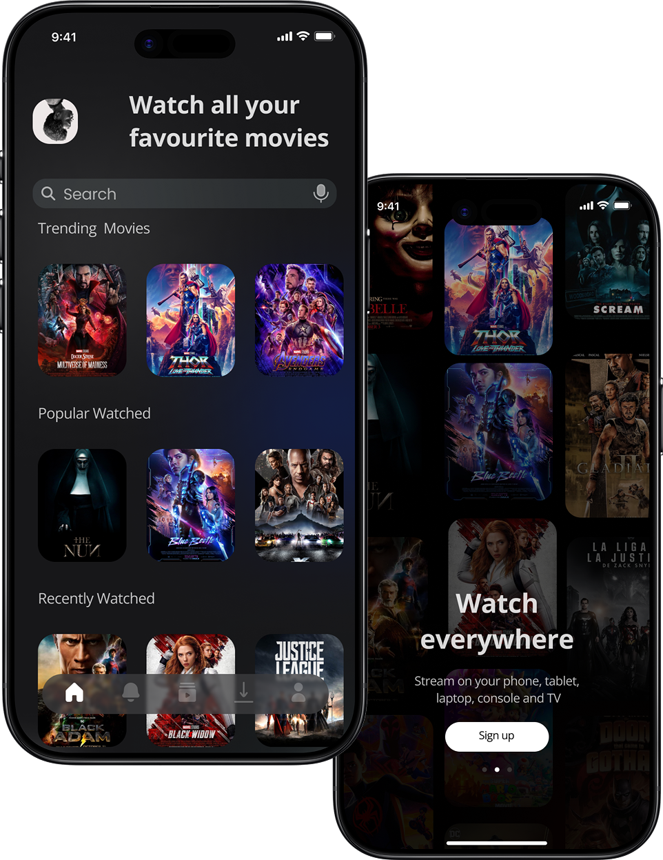
Create a poster-first, black & white UI that surfaces:
Empathize Phase
Understanding users and competitors:
Design process
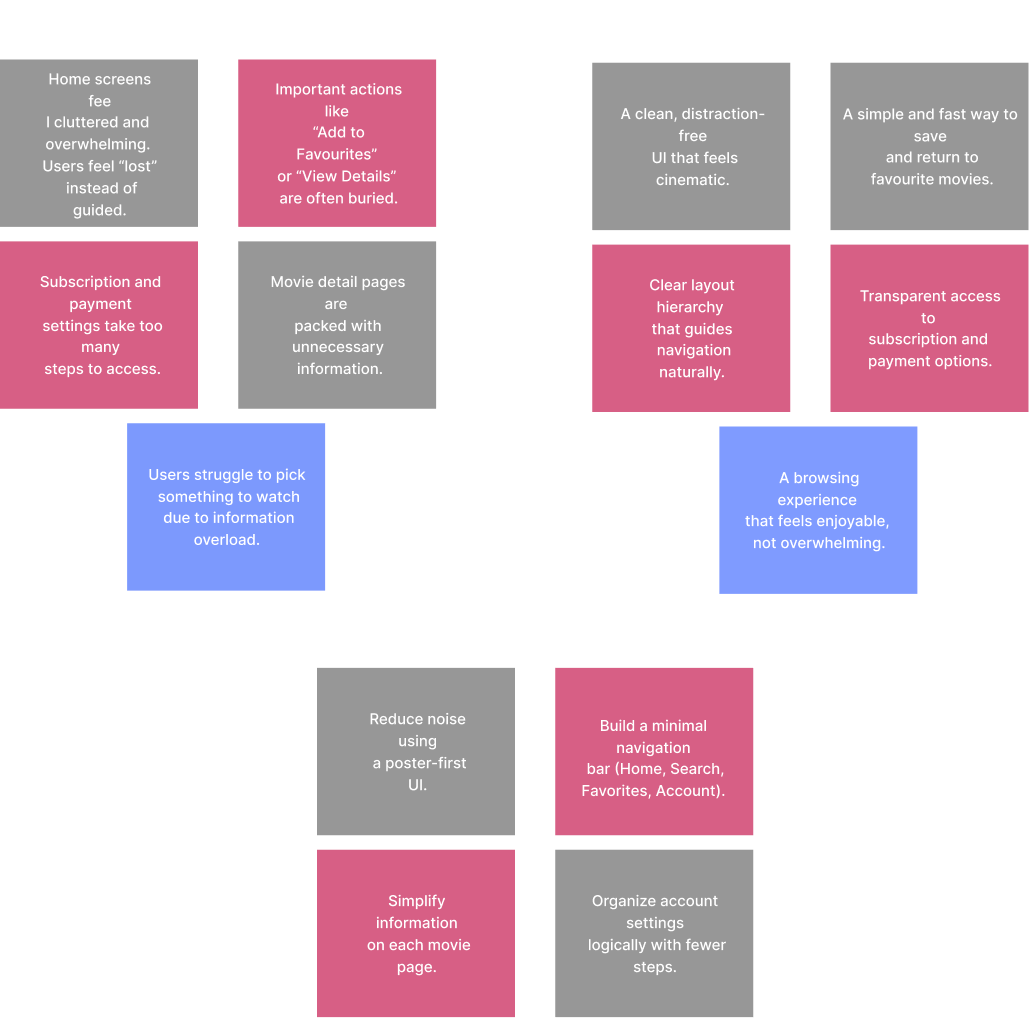
From research and interviews we synthesized:
Key user problems
User needs
Hypothesis
If MyMovies provides a movie-only, minimal interface with big visuals, quick save/download actions, and a top-level Continue Watching area, users will discover and consume films faster and with less frustration.
Design process
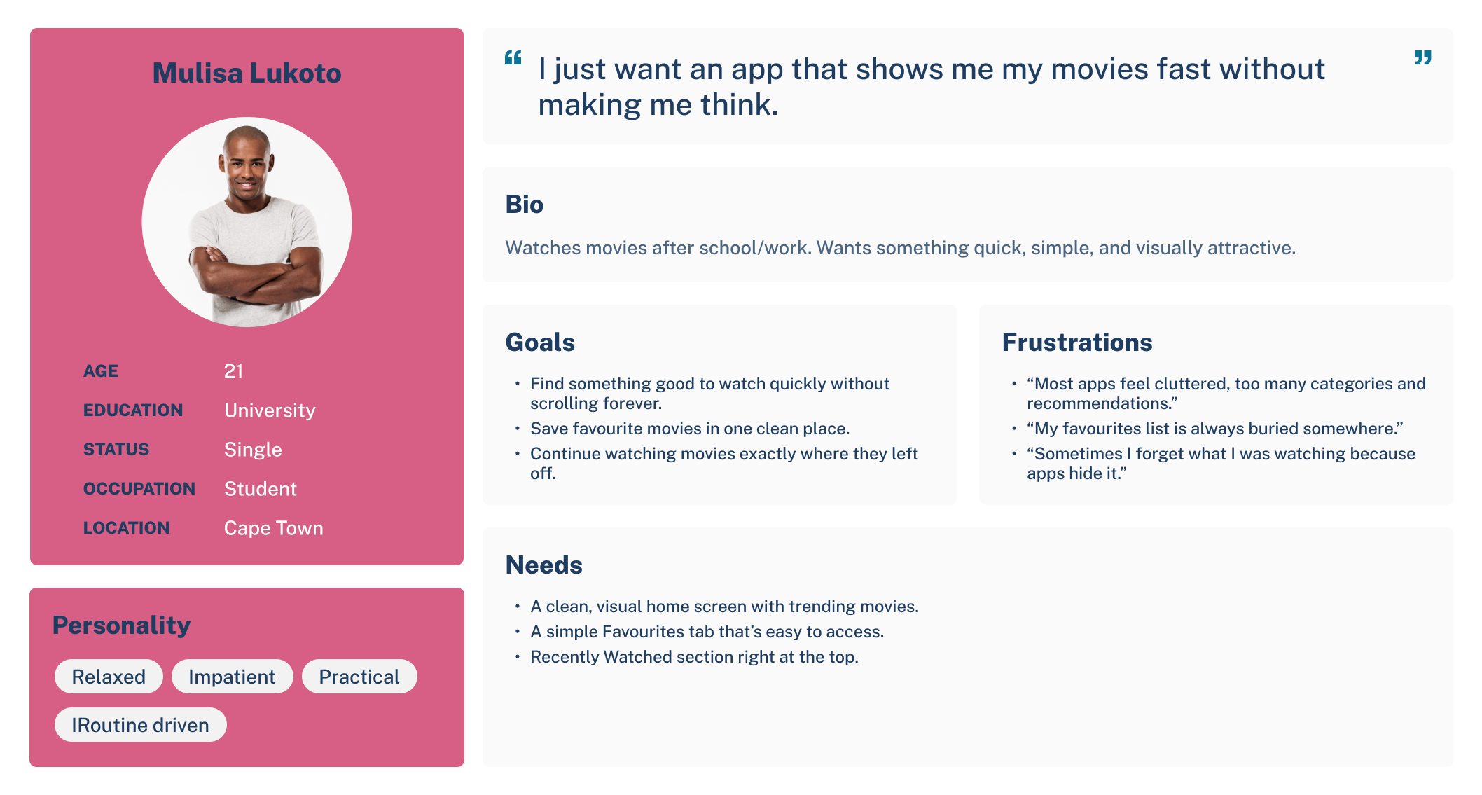
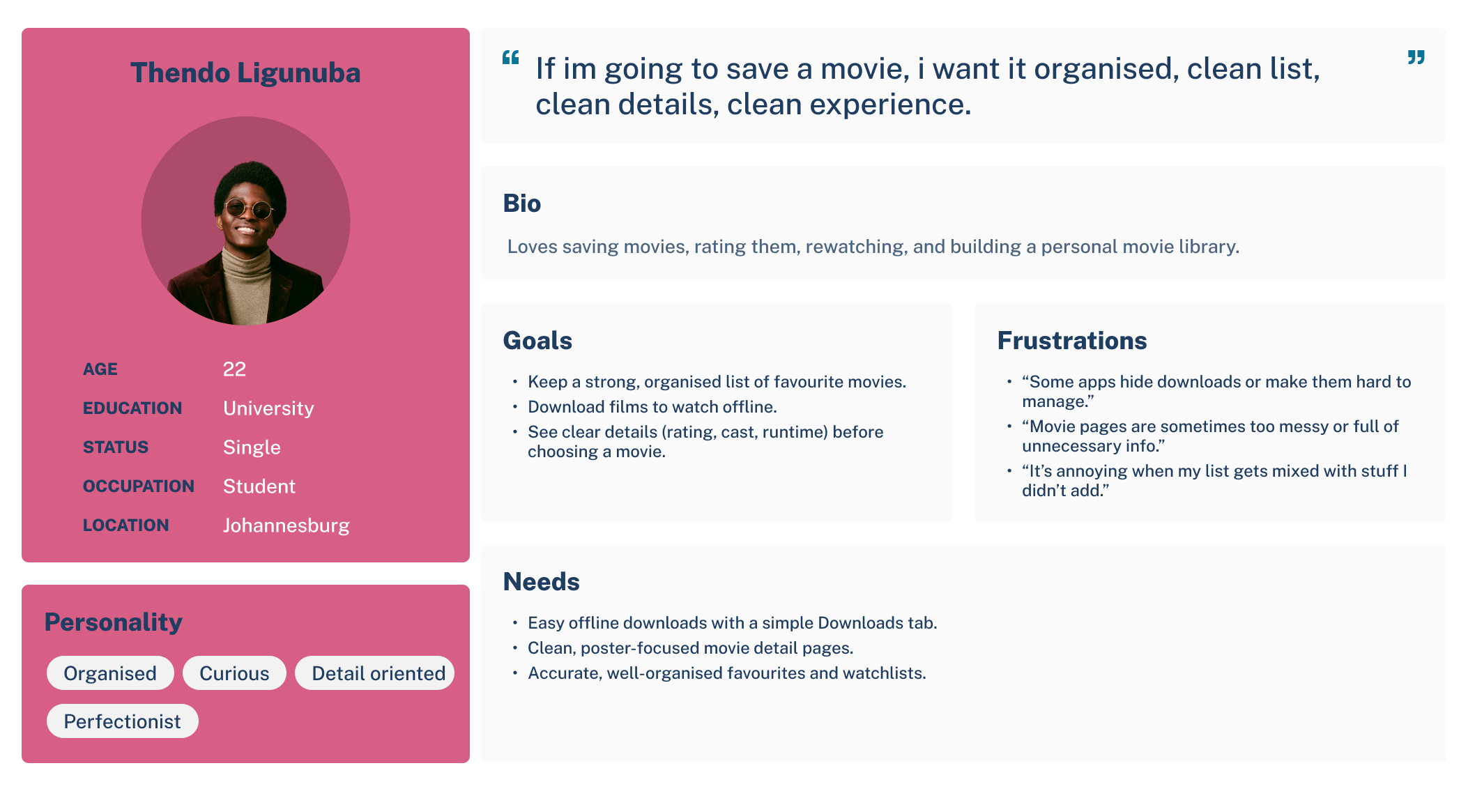
Leveraging insights gathered from user interviews, pain-point mapping, and competitive analysis, I developed two primary personas representing the core users of MyMovies. These personas acted as a strategic foundation throughout the project, ensuring that every design decision reflected real user needs, expectations, and behaviors. By grounding the product in user-centered thinking, MyMovies aimed to deliver a more intuitive, satisfying, and frustration-free movie-watching experience, ultimately improving usability, engagement, and long-term retention.
Ideate Phase
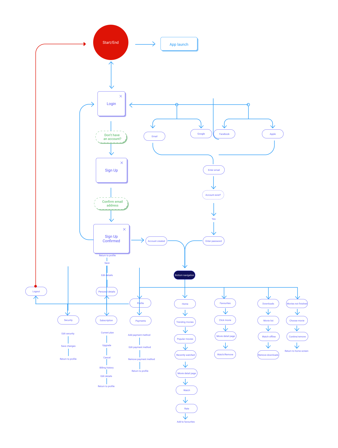
The User Flow and Task Flows (3) were used to map out how users would ideally interact with the design. This has helped to ensure a smooth and intuitive experience by:
Design process
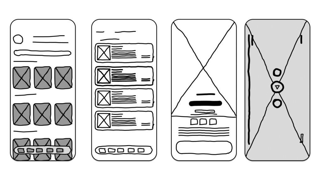
The low-quality fidelity stage was all about exploring ideas quickly and testing structure before committing to visual details. At this point, the objective was to capture the core flow of a movie-only experience: simple navigation, clear browsing paths, and fast access to favourites, downloads, and unfinished movies. Users emphasized frustration with overcrowded homepages and mixed-content apps, so these early sketches focused on reducing cognitive load and creating clarity from the very beginning.
Low fidelity allowed me to experiment with alternative layouts, different home arrangements, various ways to display movie posters, and several options for managing the “Continue Watching” and “Downloads” sections. Because these sketches were intentionally rough, I could rapidly iterate on ideas without worrying about typography, colors, or spacing. Instead, the focus was purely on flow, simplicity, and defining a structure that aligned with what users said they wanted: a clean and predictable movie-only app that doesn’t waste time.
These low-fidelity explorations helped identify what felt intuitive and what didn’t. They made it easier to remove unnecessary steps, clarify button placements, and streamline the overall navigation early on. This foundation ensured that when I transitioned into the mid-fidelity fidelity, every screen was grounded in user needs and supported by validated structural decisions.
Design process
From test interviews and early sketches:
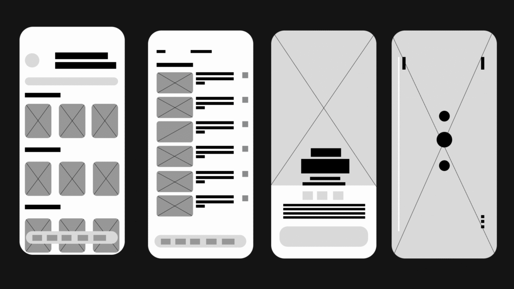
From the insights gathered during user interviews, participants consistently highlighted how overwhelming most streaming platforms feel — especially those that mix movies and series into the same space. Users mentioned that they often struggle to find what they’re in the mood for, get lost in cluttered homepages, and feel frustrated when platforms push irrelevant content. Because MyMovies is intentionally movies-only, the early wireframes focused on simplifying discovery, reducing cognitive load, and giving users a cleaner, more predictable browsing experience.
A major pain point users expressed was losing track of movies they wanted to watch later, forgetting which ones they had already started, and not having reliable offline options for when they travel or run out of data. These insights directly shaped the core structure of the low- and mid-fidelity screens. The goal was to create an experience where users could quickly save favourites, easily return to unfinished movies through a dedicated “Continue Watching” row, and download content for offline viewing without confusion.
Participants also emphasized the need for a visually calm environment since movie posters already contain bright artwork. Instead of adding unnecessary UI clutter, the early wireframes focused on spacing, clear hierarchy, and simple navigation. Each section — Home, Search, Downloads, and Favourites — was designed to be immediately recognisable and scannable. The layout prioritised larger movie cards with readable spacing, ensuring users can browse effortlessly without feeling visually overwhelmed.
Because MyMovies is built around intentional simplicity, the design decisions for the low–mid wireframes revolved around stripping away noise and supporting behaviours users naturally expressed: quick discovery, seamless saving, effortless resuming, and reliable offline access. These early structures laid the foundation for a clean, smooth, movie-only browsing experience that feels lighter and calmer than typical streaming apps.
Design process
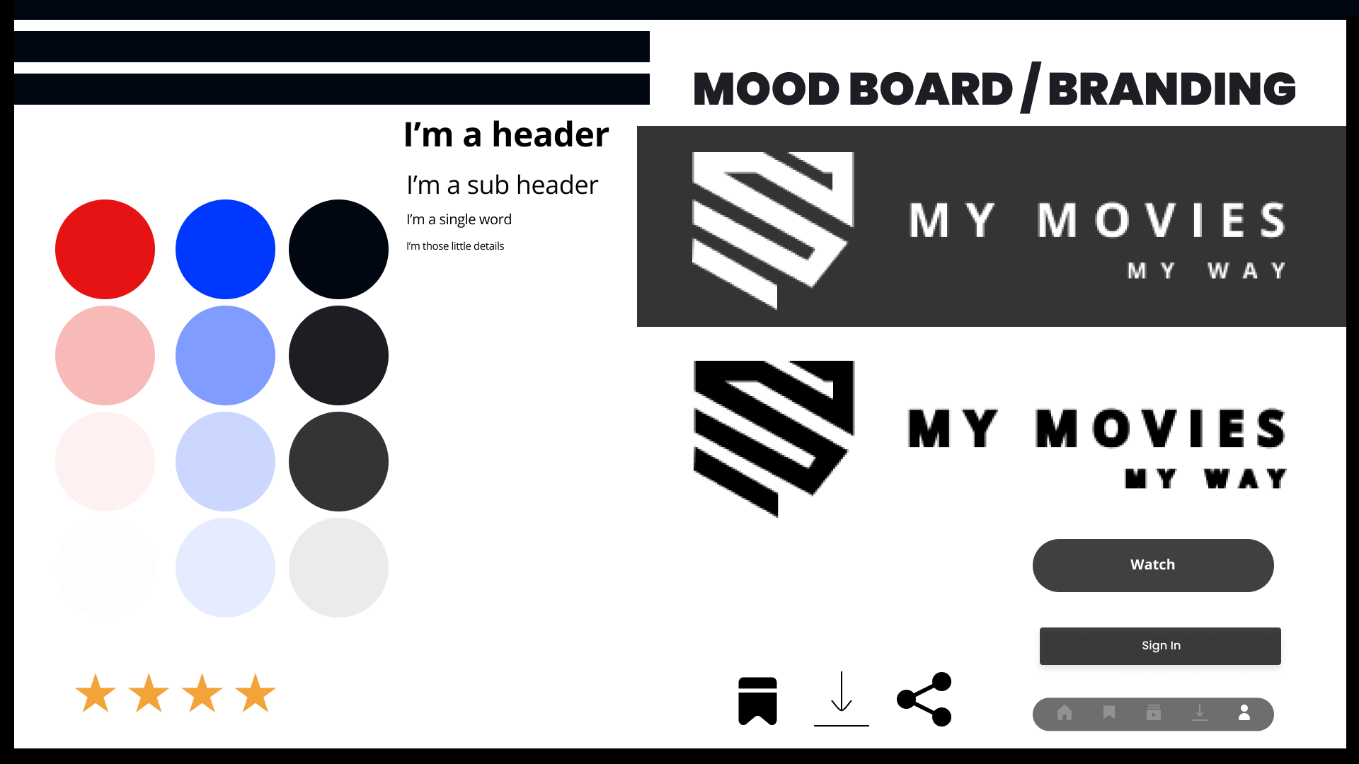
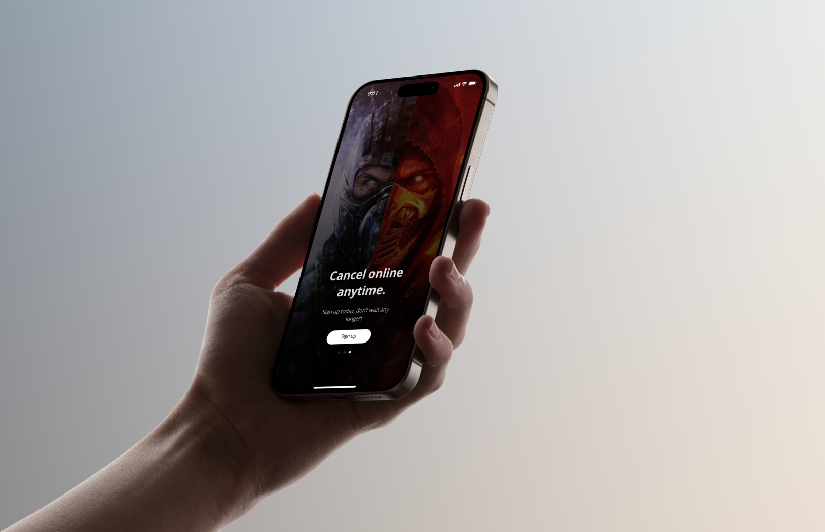
The branding phase played a crucial role in shaping the identity of MyMovies. Because the app focuses exclusively on movies, the visual language needed to feel cinematic, modern, and distraction-free. User interviews revealed that people often feel overwhelmed by bright, cluttered streaming interfaces, so the goal was to build a brand that reflected calmness, clarity, and a premium viewing experience.
The decision to use a dark palette was intentional — it allows movie posters to stand out naturally, reduces eye strain, and creates a familiar “cinema-like” environment. Typography was chosen for its balance of personality and readability, ensuring that titles, categories, and labels remain bold, clear, and instantly scannable. The logo and iconography follow this same philosophy: simple shapes, clean silhouettes, and a minimal style that keeps the focus on the films, not the interface.
Overall, the branding of MyMovies supports the product’s core principle — a streamlined movie-only experience that feels premium, focused, and free from unnecessary visual noise. The brand decisions created a strong foundation for the UI screens, ensuring consistency across the entire app and reinforcing the calm, enjoyable browsing experience users expressed they wanted.
Design process
What the hi-fi stage validated:
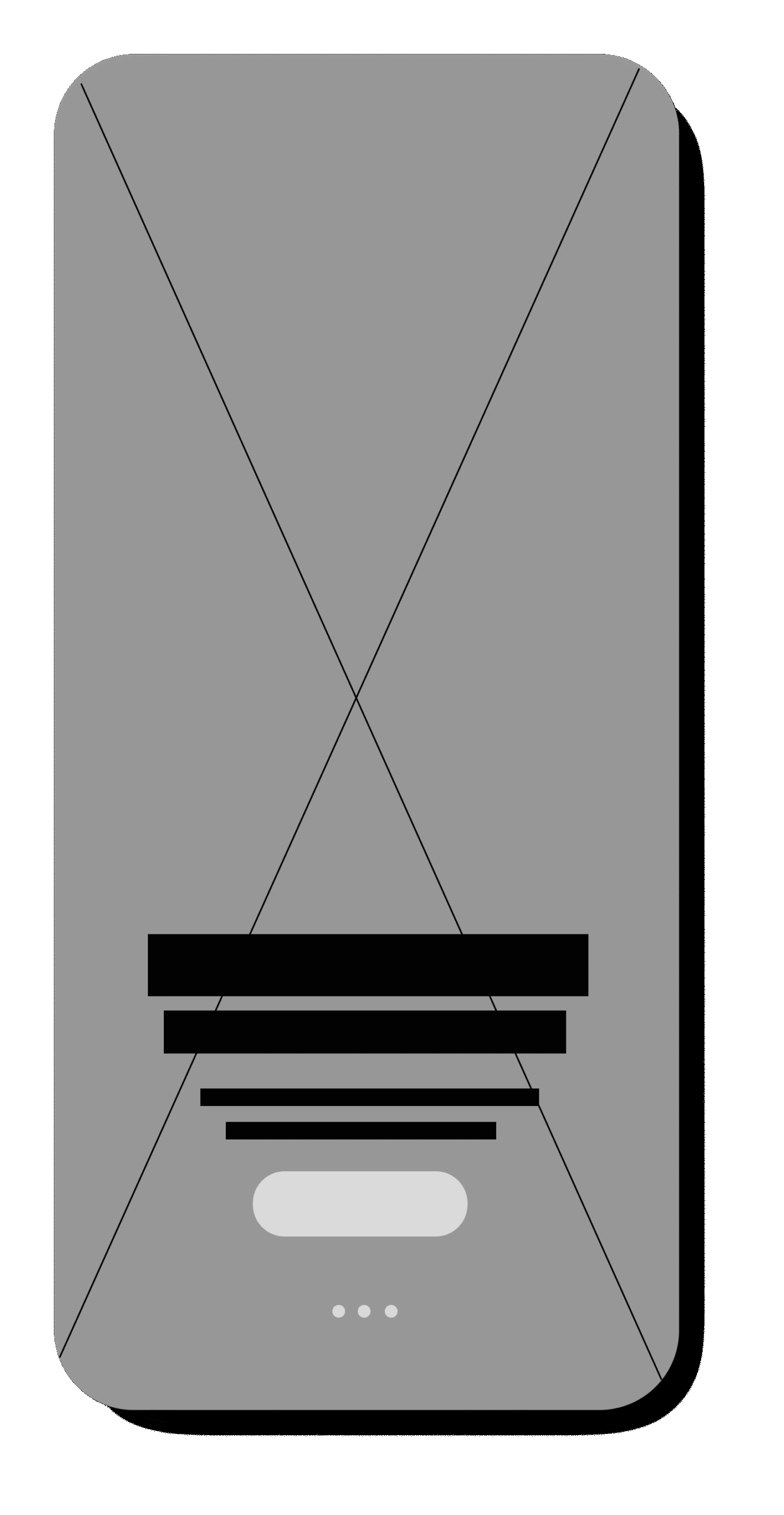
By creating a high-fidelity model, I was able to thoroughly test the app’s interface and interactions long before any development began. This allowed me to validate the visual hierarchy, spacing, dark-theme aesthetic, and motion transitions in a realistic environment. Through testing, I identified areas where touch targets needed to be larger, poster spacing needed refinement, and certain labels required more clarity for quick scanning.
The high-fi stage also helped confirm that a movie-only layout creates a noticeably calmer and less cluttered experience compared to mixed movie-and-series platforms. Key components such as the “Continue Watching” rail, the “Smart Favourites” section, and the offline download manager were tested for usability, ensuring every feature supported quick decision-making and minimal friction.
Because these issues surfaced early, I was able to refine navigation patterns, optimize spacing for readability, and ensure the interface felt fast, modern, and intuitive. This process not only strengthened usability but also prevented larger development challenges later in the pipeline — ultimately saving time and improving the overall quality of the final product.
Testing phase
To assess the clarity, usability, and overall viewing experience of MyMovies, I conducted remote usability testing with 5 participants who matched the profiles of casual movie watchers and frequent streaming users. Because the app is movie-only, participants were selected specifically for their frustrations with mixed-content platforms that combine movies and series.
Structured Feedback
A feedback grid was used to categorize findings into:
Pattern Identification: An affinity map was created to group recurring behaviors, such as navigation habits, how users search for movies, and preferences around layout.
Prioritization: A severity–frequency matrix helped identify which problems required the most urgent design changes. These were compared against the goals of the app: simplicity, speed, and clarity.
Testing phase
Participants were asked to complete core flows that represent the primary use cases of MyMovies:
How Users Tested “Playback” Without Real Movies
Since MyMovies is a prototype and doesn’t contain any licensed films, playback was simulated through:
Success Metrics
Task Success Rate: Measured whether participants could complete each task without abandoning or asking for help.
Error Identification: Tracked moments of hesitation, incorrect taps, misclicks, backtracking, or confusion.
User Satisfaction:After each task, participants rated:
Testing phase
What worked well:
What caused confusion:
What users consistently appreciated:
Key Findings Summary
From the recordings, all insights were placed into a Feedback Grid, which was then merged with the Affinity Map to identify patterns.
The findings highlighted opportunities to improve:
Final prototype
Based on user testing, several improvements were made:
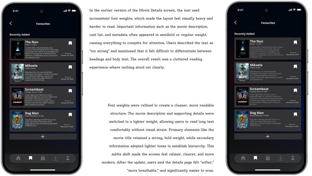
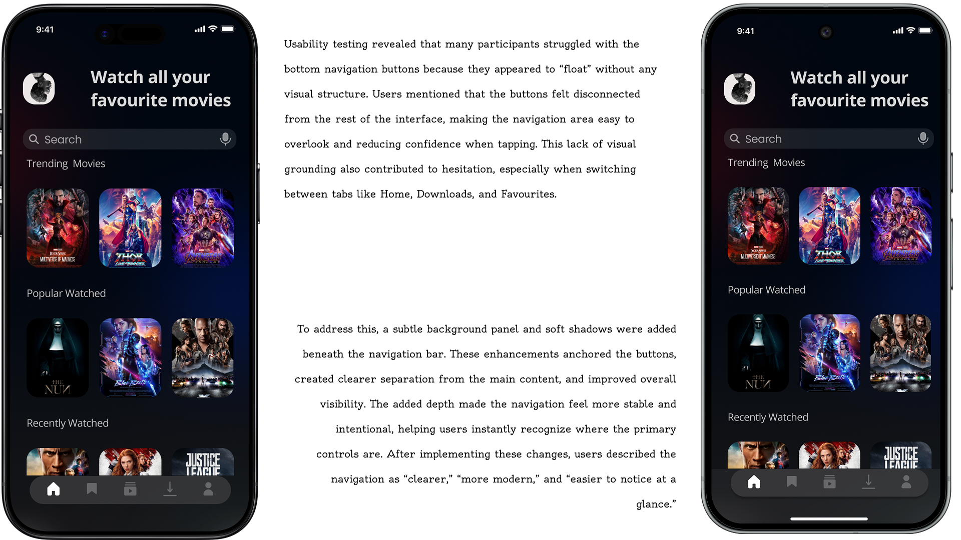
Users wanted clear button layout
Users wanted a clear background of when reading movie details onnspecific pages.
Some participants struggled with page sliding/dragging
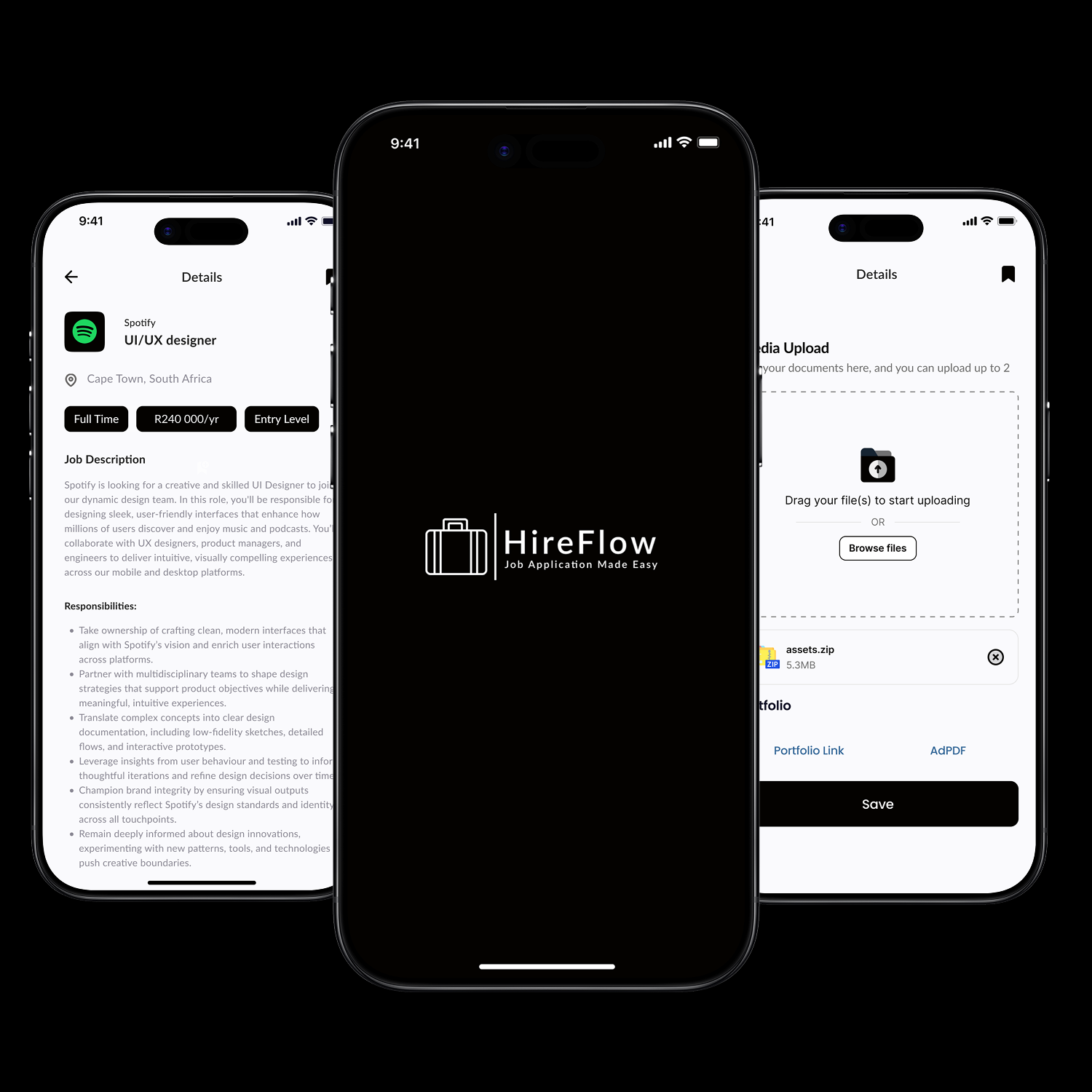
An end-to-end job application tracker that helps seekers discover, apply, and stay organized. A single platform to simplify the entire job hunt journey.
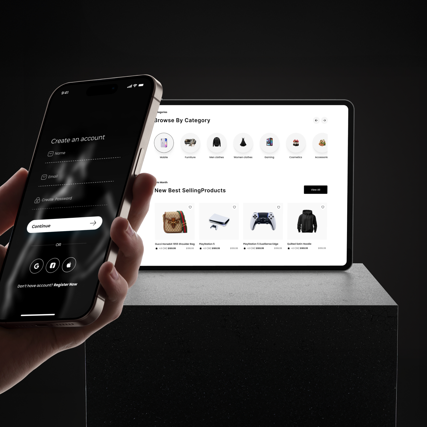
An end-to-end e-commerce platform that helps shoppers discover and buy unique products. A single platform to simplify the global shopping experience.