
Wasabi Graphics
Designing interfaces: experiences that inspire action.
Every interface I design is guided by usability, storytelling, and a passion for impactful digital experiences.
About
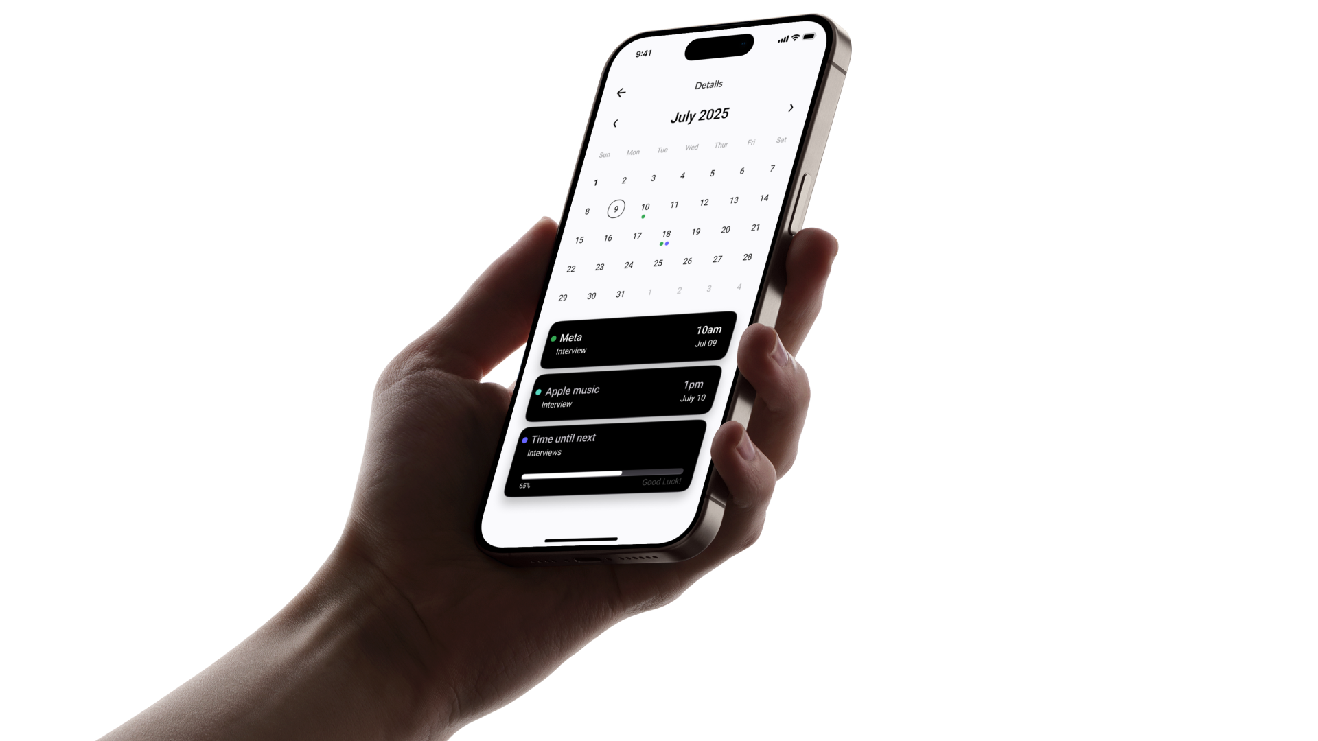
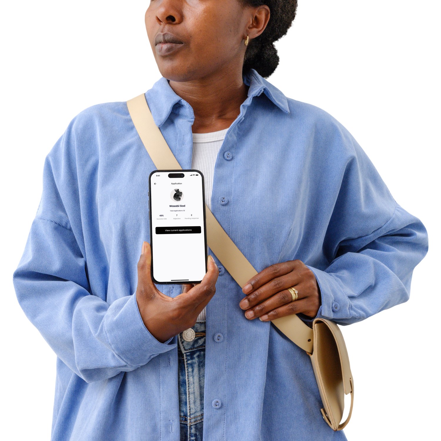
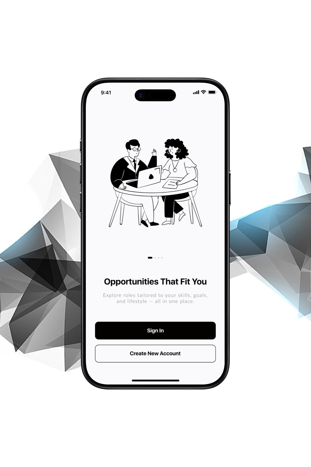
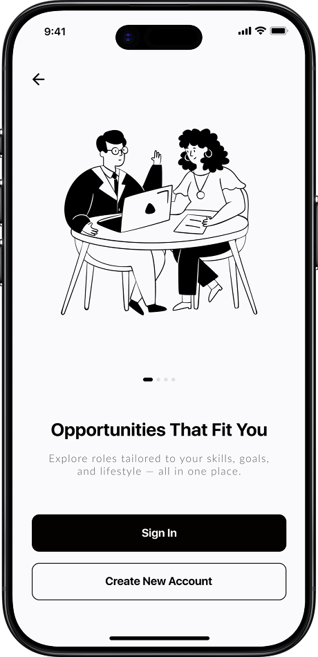
Hireflow — an end-to-end job application tracker that helps users discover, apply, and stay organized. A single platform to simplify the entire job-hunt journey.
Job seekers face a fragmented experience. They apply to dozens of jobs, wait weeks to hear back, and lose track of interviews and follow-ups. Many end up juggling spreadsheets, sticky notes, and scattered email threads just to stay organized.
The Job Application Tracker App centralizes the entire journey:
Design process
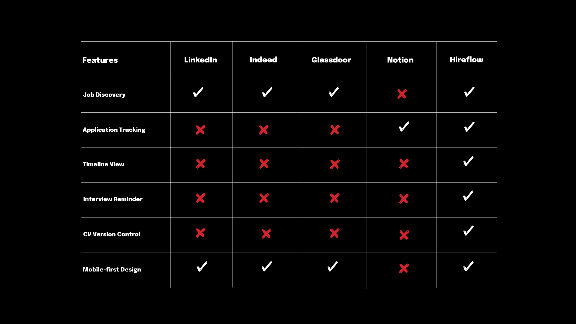
Understanding job seekers and analyzing existing job-hunting tools was the first step. A competitive analysis helped us:
Design process
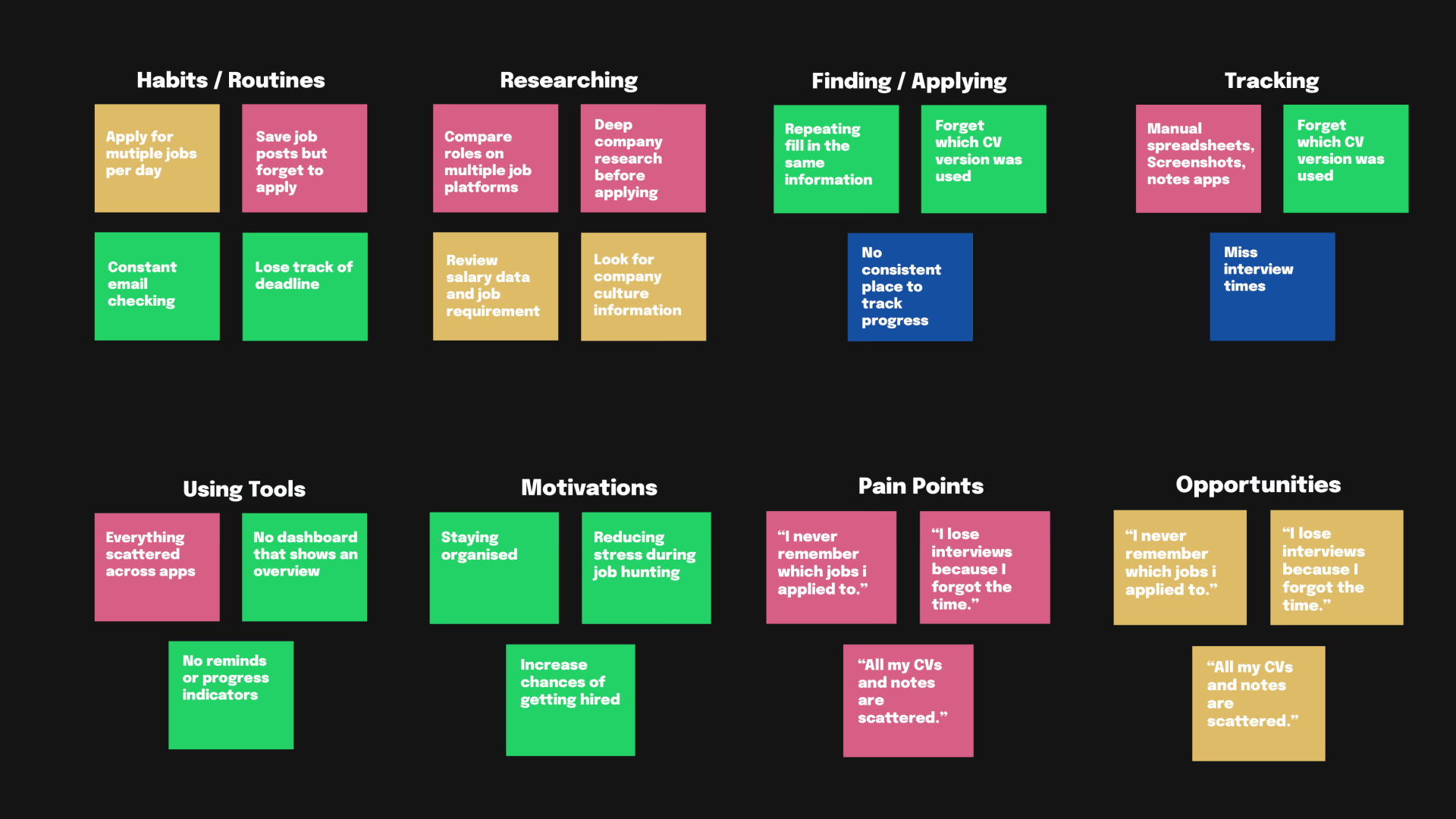
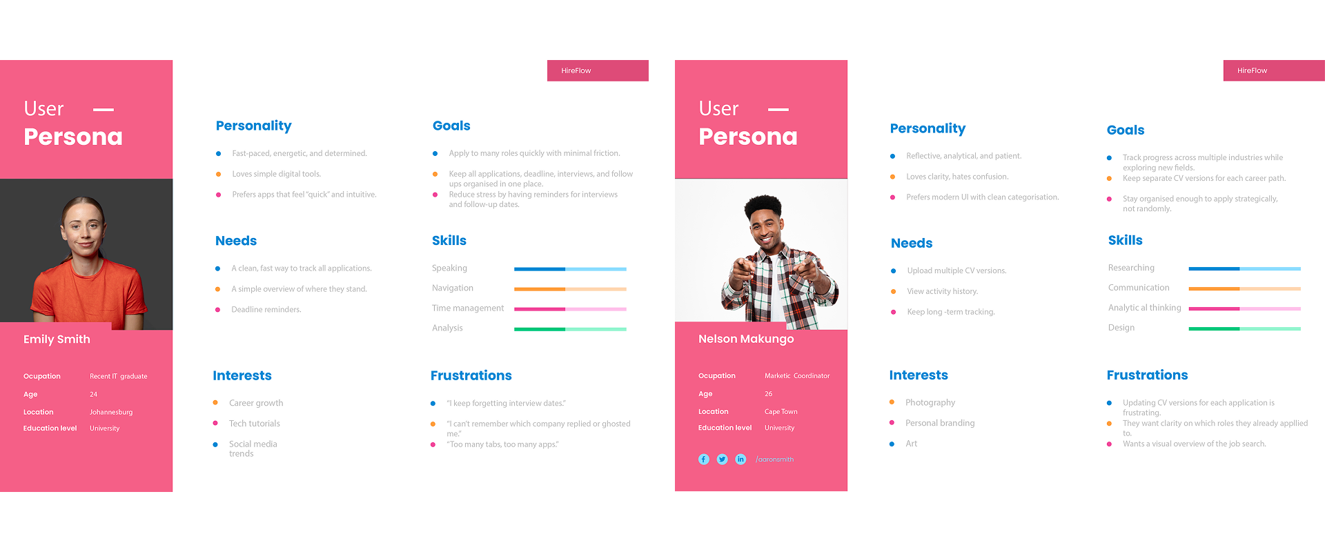
To better understand job seekers’ needs, I synthesized research into key insights:
Problem Statement (for design):
Job seekers need a unified place to track and manage all their applications and communication.
Hypothesis:
If Hireflow provides a clean, intuitive interface with tracking, reminders, and a dashboard, users will be more confident and organized during their job search.
Design process
Additional research
About
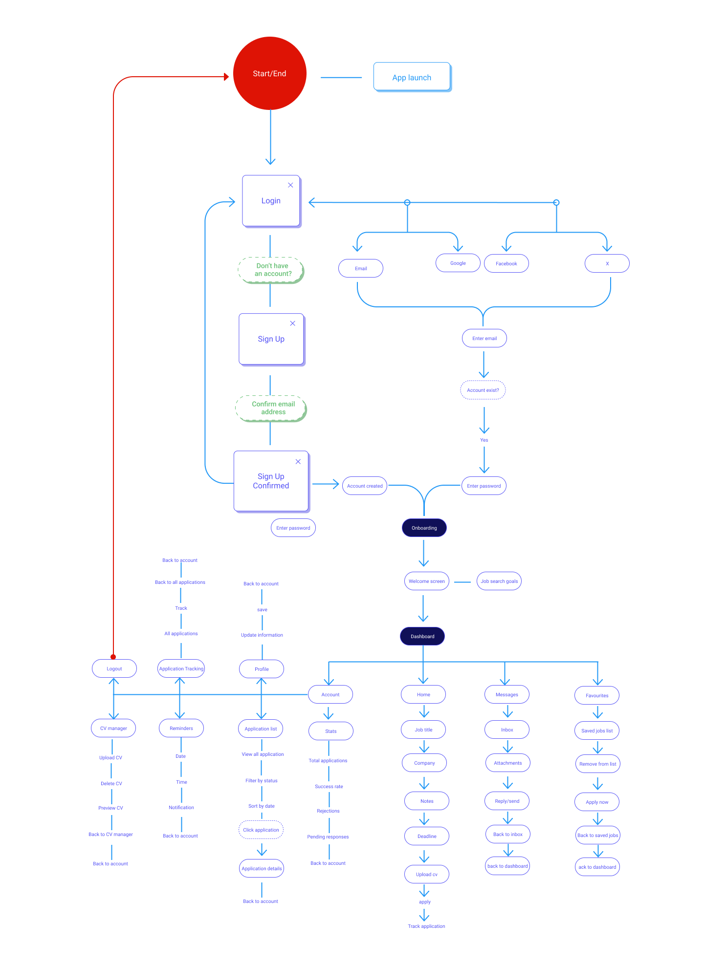
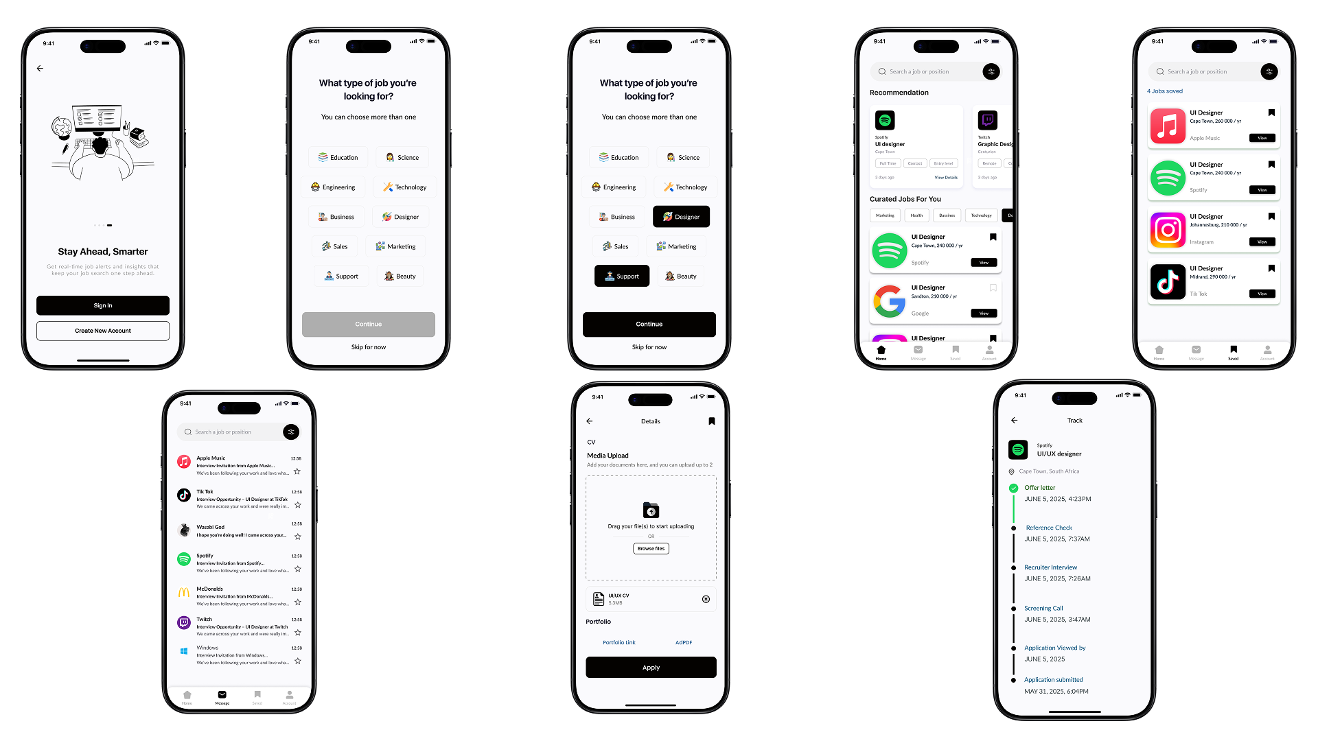
Before building high-fidelity screens, I mapped the core journey users take inside Hireflow. This flow helps visualize every key step, from onboarding to tracking applications — and ensures the entire experience feels simple, predictable, and stress-free.
Design process
Design process
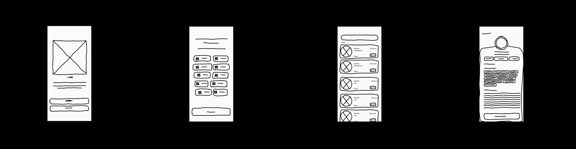
From the insights gathered during user interviews, participants emphasized the need for a more organized and stress-free job search experience. Many job seekers mentioned that they often lose track of interview dates, forget which roles they applied for, and struggle to manage multiple applications at once. Because of this, the main objective of the early wireframes was to design an onboarding and tracking experience that reduces confusion and helps users stay in control of their job search.
Participants also highlighted the importance of having all job-related information — including application status, saved jobs, messages from recruiters, and upcoming reminders. As a result, these core pain points guided the structure of the low- and mid-fidelity screens. We focused on creating a simple flow that allows users to quickly log applications, view deadlines, check updates, and save roles for later. These priorities directly shaped the layout of the dashboard, home feed, favourites, and reminders sections.
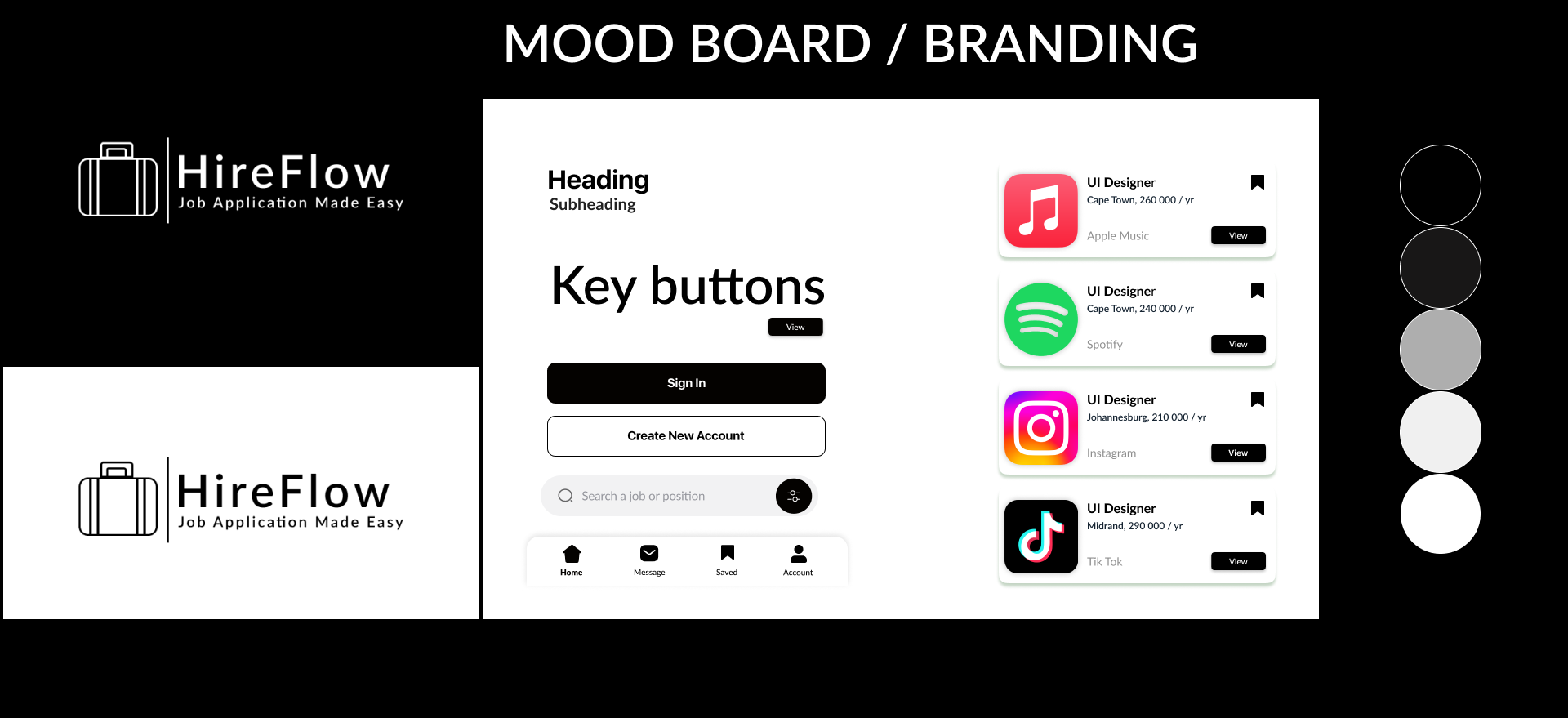
The decision to use a mostly black-and-white color palette in HireFlow was driven by participants’ preference for a clean, professional environment that reduces distraction during the job search process. Users emphasized that applying for jobs already feels mentally overwhelming, so a minimal, contrast-based interface helps them stay focused on their progress rather than the interface itself. The typeface and button sizing were chosen for clarity and readability, supporting quick scanning when users are moving between multiple applications or checking updates on the go. Additionally, the suitcase logo paired with the “HireFlow” wordmark was intentionally designed to represent career progression and movement symbolizing a streamlined journey from application to employment.
Design process
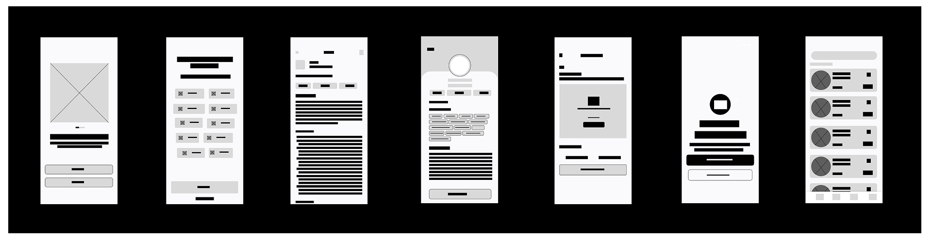
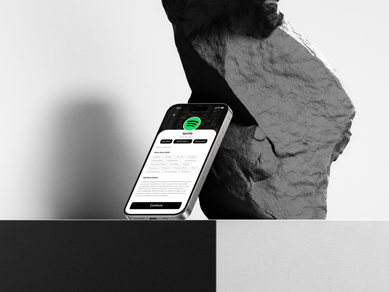
By developing a high-fidelity prototype for HireFlow, I was able to simulate the full user experience long before any development took place. This allowed me to test realistic interactions, validate each step of the application-tracking flow, and uncover usability issues that weren’t visible in earlier wireframes. Because these insights were gathered early, I was able to refine the interface, strengthen the visual hierarchy, and ensure the design felt intuitive and consistent. This approach not only improved the overall quality of the product but also saved time by preventing larger problems later in the process.
Design process
To evaluate the clarity and usability of HireFlow, I conducted remote usability testing with 5 participants who matched the profiles of early-career job seekers and career switchers.

About
Participants were asked to complete core flows based on HireFlow’s most important features:
These flows were chosen because they represent the primary daily interactions of job seekers.
Design process
What worked well
What caused confusion
What users consistently appreciated
Key Findings Summary
Meeting was reviewed and all notes were organized into a Feedback Grid, which formed the foundation of the Prioritization Grid.
Patterns showed several opportunities for improvement related to:
About
Design ess
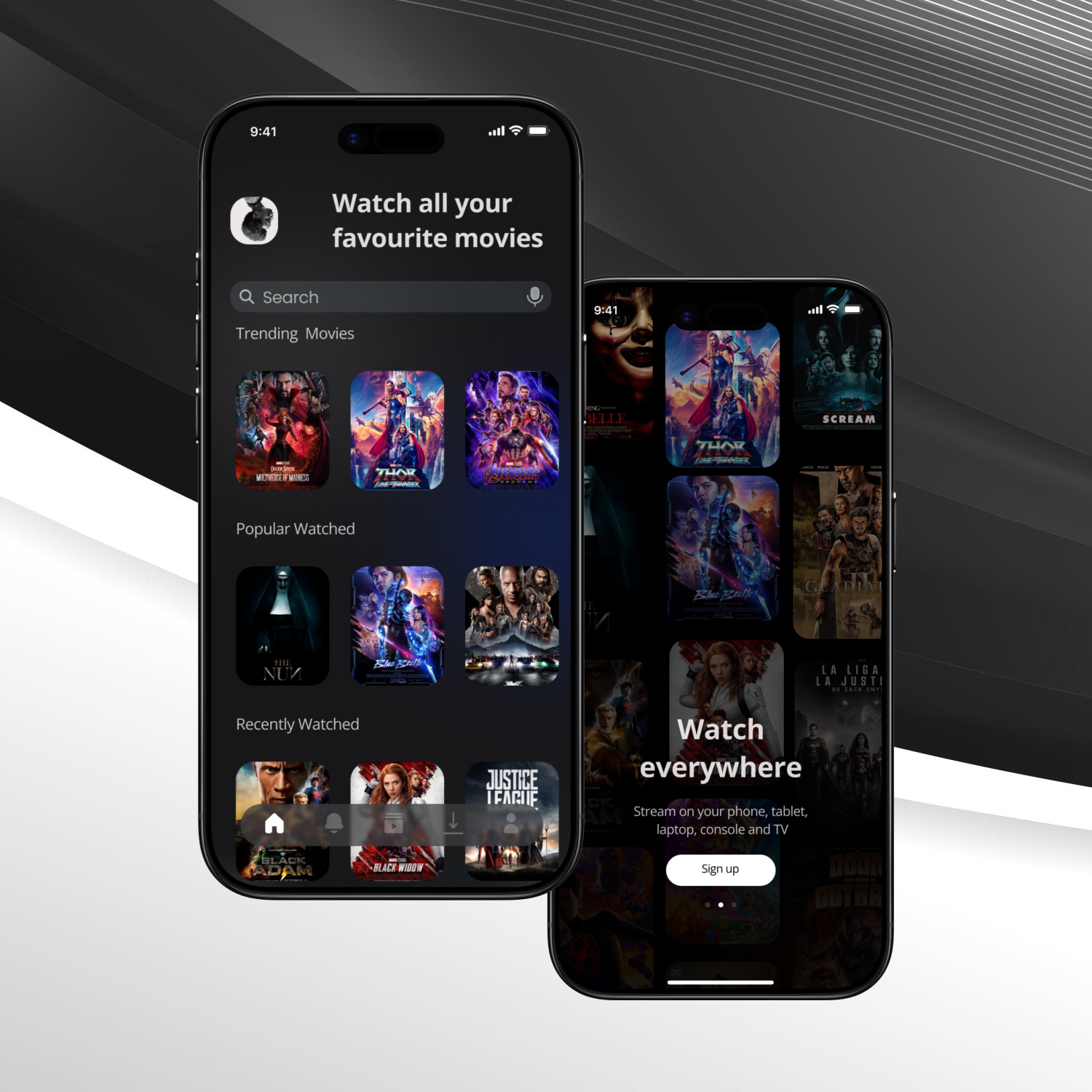
ilmly is an end-to-end movie companion that helps viewers discover, track, and enjoy films. A single platform to simplify the movie-watching journey.
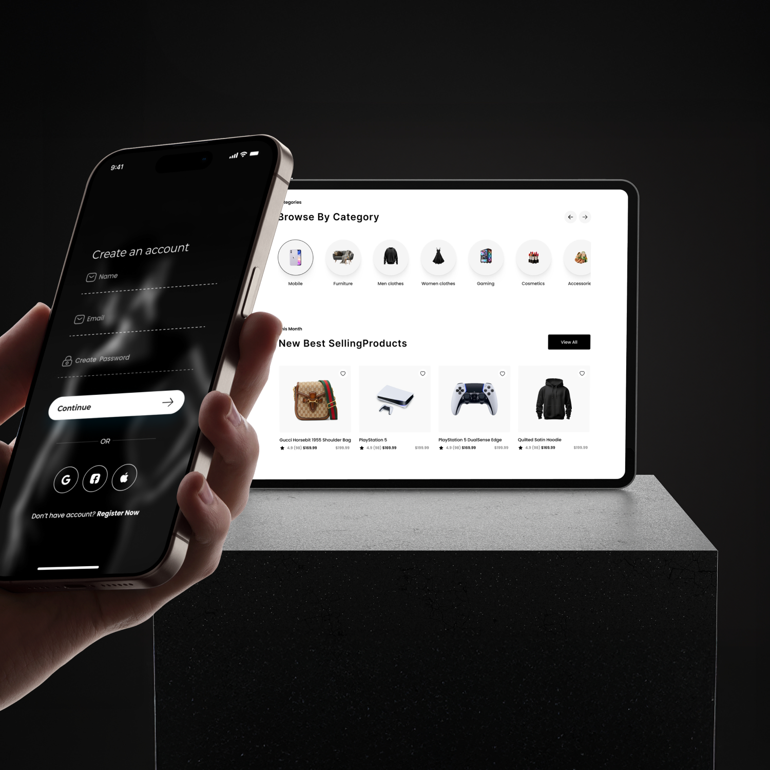
An end-to-end e-commerce platform that helps shoppers discover and buy unique products. A single platform to simplify the global shopping experience.