


Wasabi Graphics
Designing interfaces: experiences that inspire action.
Every interface I design is guided by usability, storytelling, and a passion for impactful digital experiences.
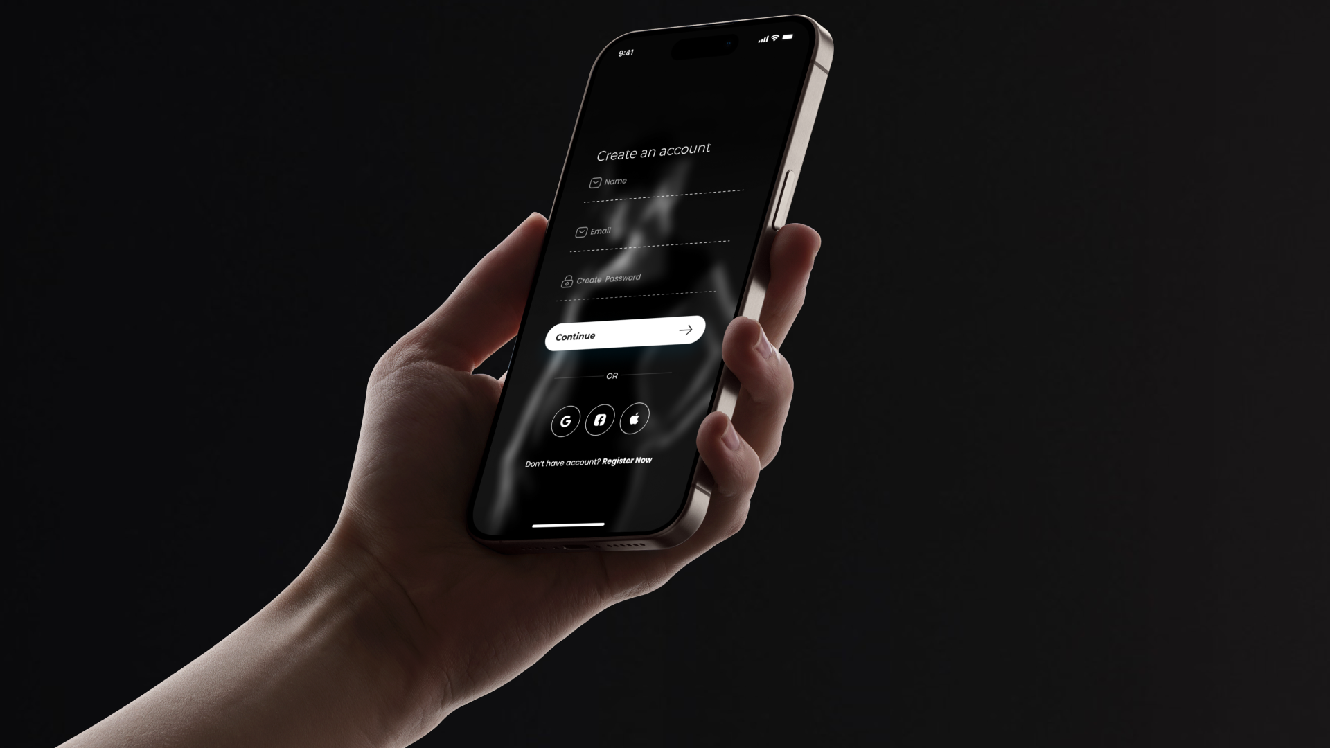
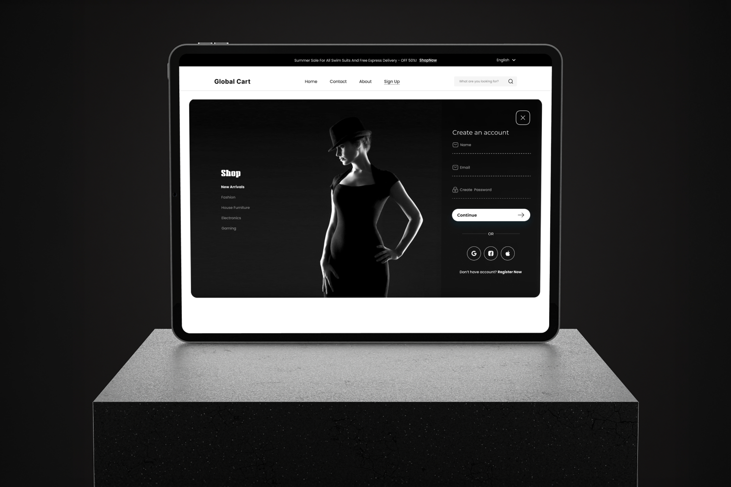
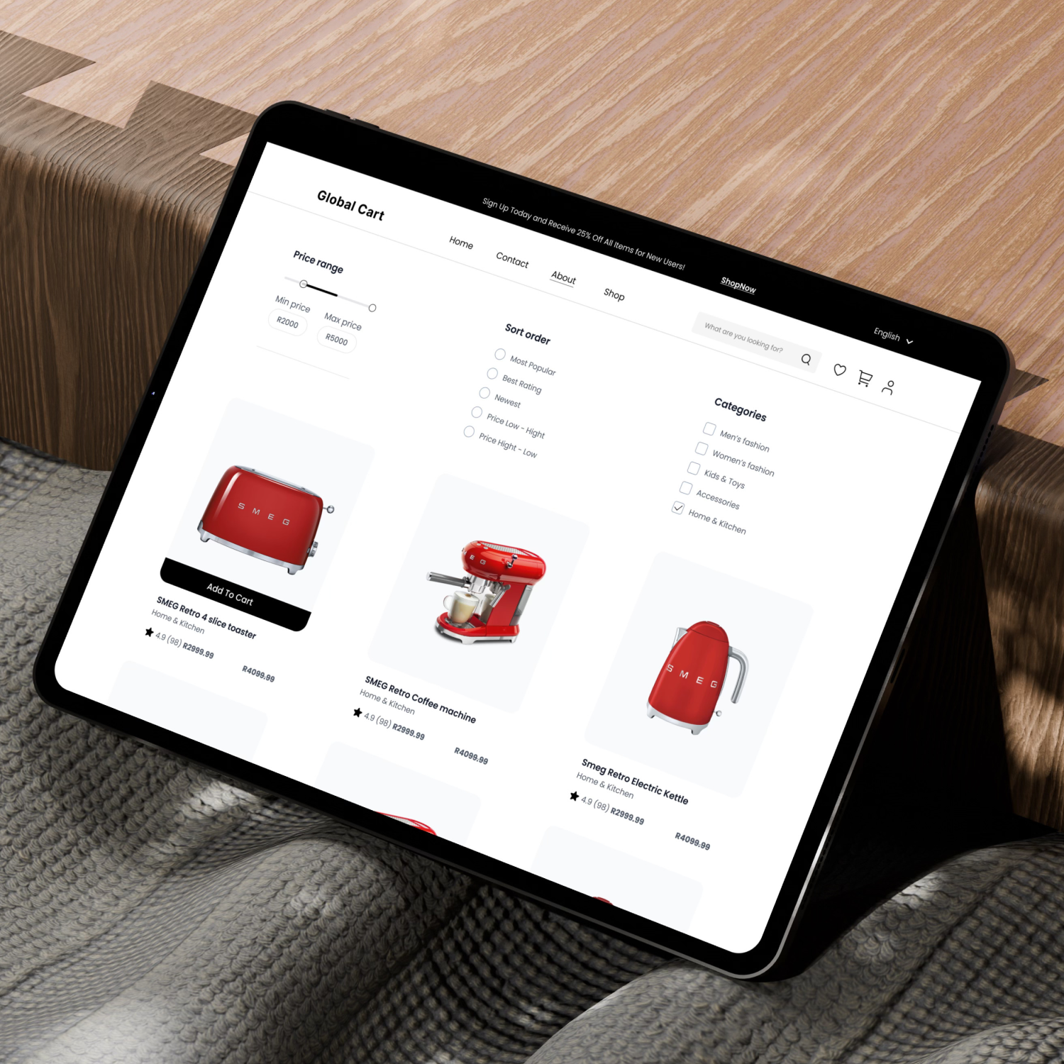
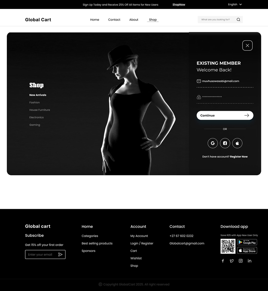
Global Cart is a modern, minimal e-commerce website designed to give users a clean and distraction-free shopping experience. Most online stores overwhelm users with visual clutter, confusing categories, and long checkout flows. Global Cart simplifies this by focusing on clarity, predictable navigation, and fast access to the cart and checkout.
The goal was to create a shopping experience that feels effortless from browsing to purchase.
Users often struggle with:
These issues lead to frustration and cart abandonment.
Global Cart aims to solve this by giving users a clean, focused interface that makes shopping simple and enjoyable.
Design process
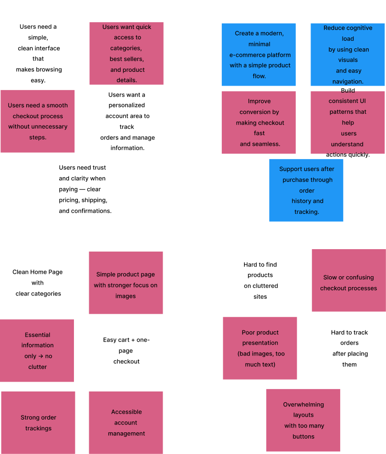
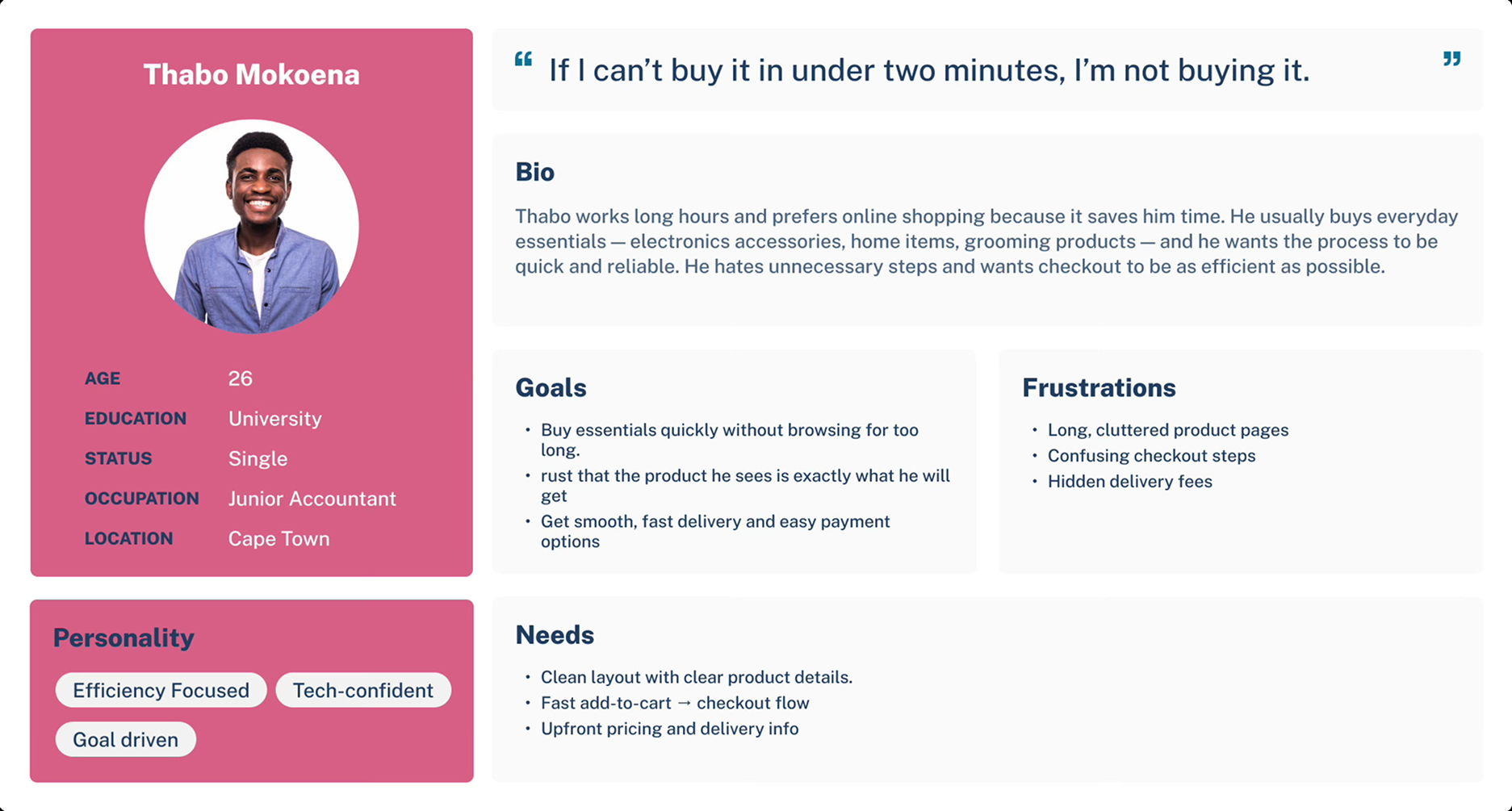
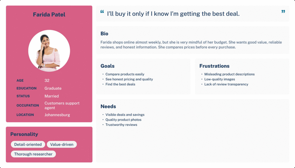
User interviews revealed strong frustration with messy, busy e-commerce interfaces. Many users simply wanted a site where they could instantly browse products without feeling overwhelmed. They also expected:
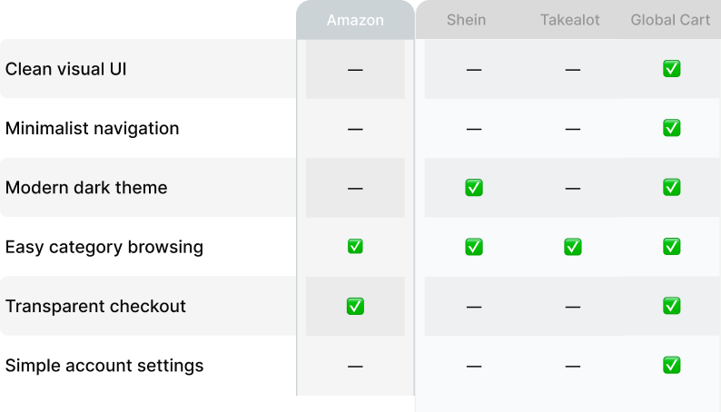
Competitor Analysis
A lightweight competitor review was done to understand what frustrates shoppers and what features users expect.
Most competitors overwhelm users with to much.
This confirmed that GlobalCart should focus on simplicity, clean spacing, predictable patterns, and a quiet visual experience.
Design process
After synthesizing research, competitor insights, and user frustrations, I defined three core goals for GlobalCart:
Users should instantly understand where to click. Clean grids, strong spacing, and predictable navigation reduce friction.
A constantly visible cart icon improves confidence and reduces the feeling of “Where did my items go?”
Less steps, clearer inputs, and clean confirmation screens help reduce drop-offs.
These principles guided every decision moving forward.
Design process
User interviews revealed strong frustration with messy, busy e-commerce interfaces. Many users simply wanted a site where they could instantly browse products without feeling overwhelmed. They also expected:
Competitor Analysis
A lightweight competitor review was done to understand what frustrates shoppers and what features users expect.
Most competitors overwhelm users with to much.
This confirmed that GlobalCart should focus on simplicity, clean spacing, predictable patterns, and a quiet visual experience.
Design process
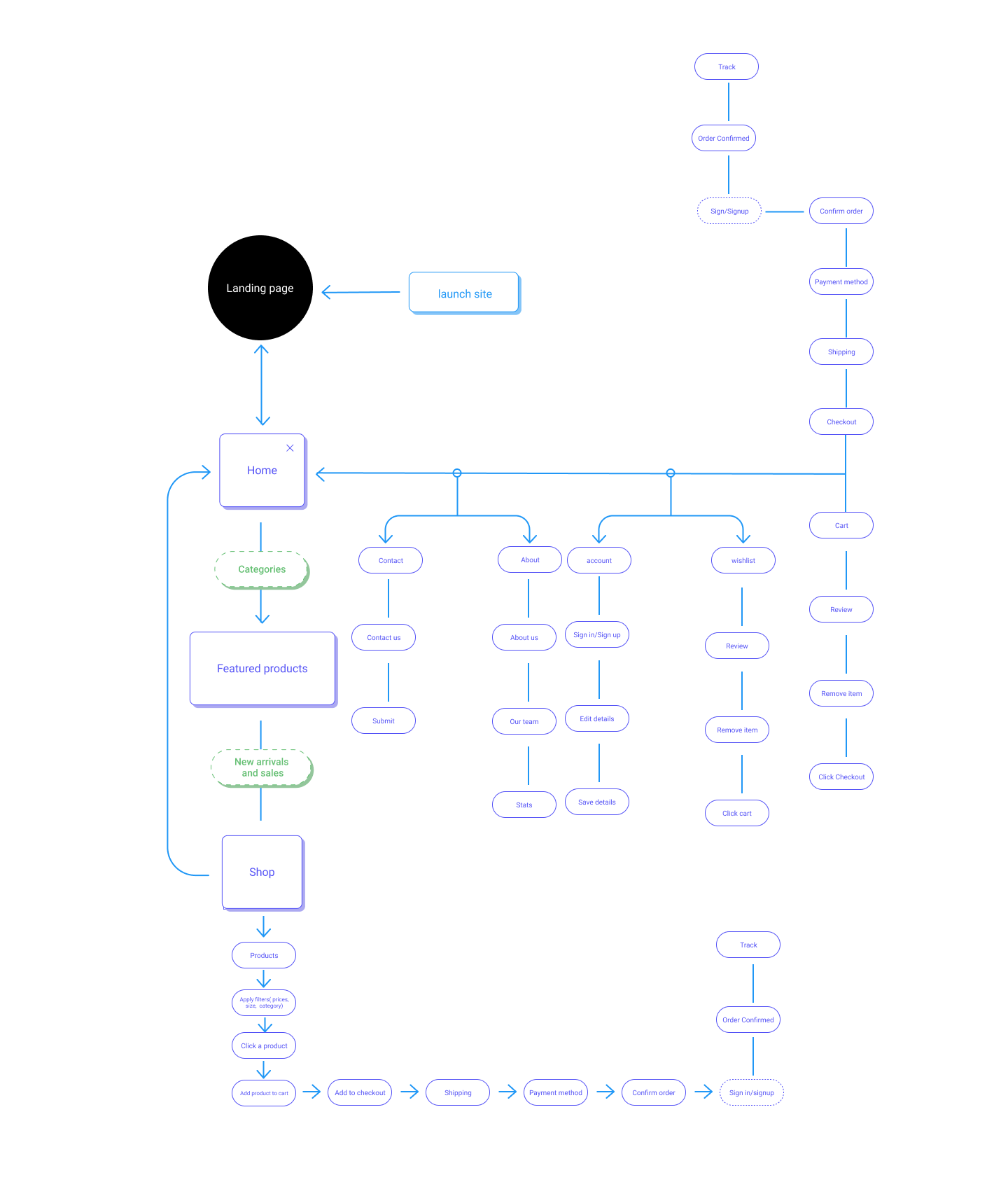
The User Flow and key Task Flows for Global Cart were created to map out how shoppers would naturally move through the website. These flows ensured that every step, from browsing to checkout, felt smooth, predictable, and effortless.
They played a crucial role by:
By clarifying these interactions early, the User Flow helped shape a shopping journey that feels clean, intuitive, and stress-free, exactly what Global Cart aims to deliver.
Design process
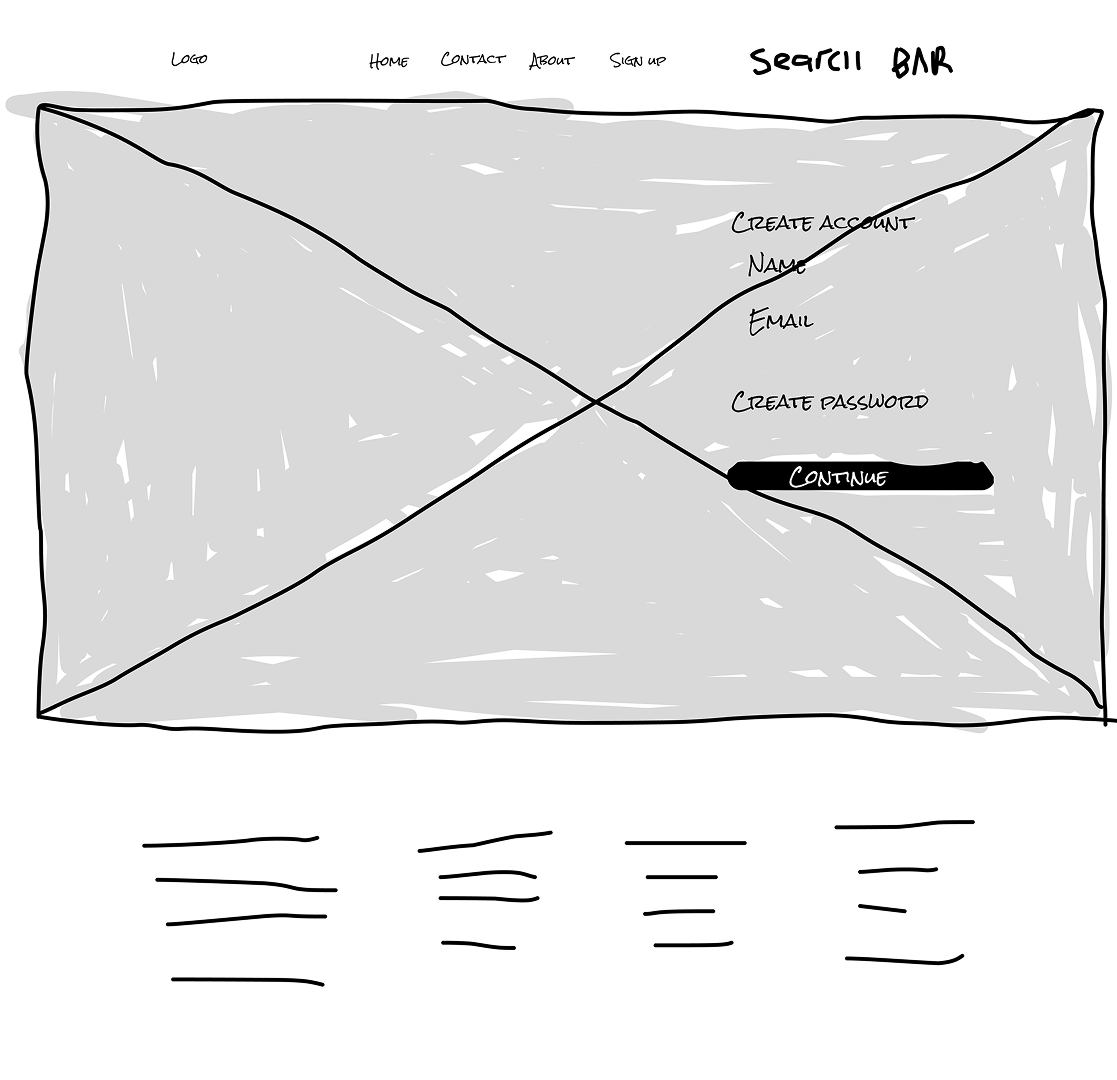
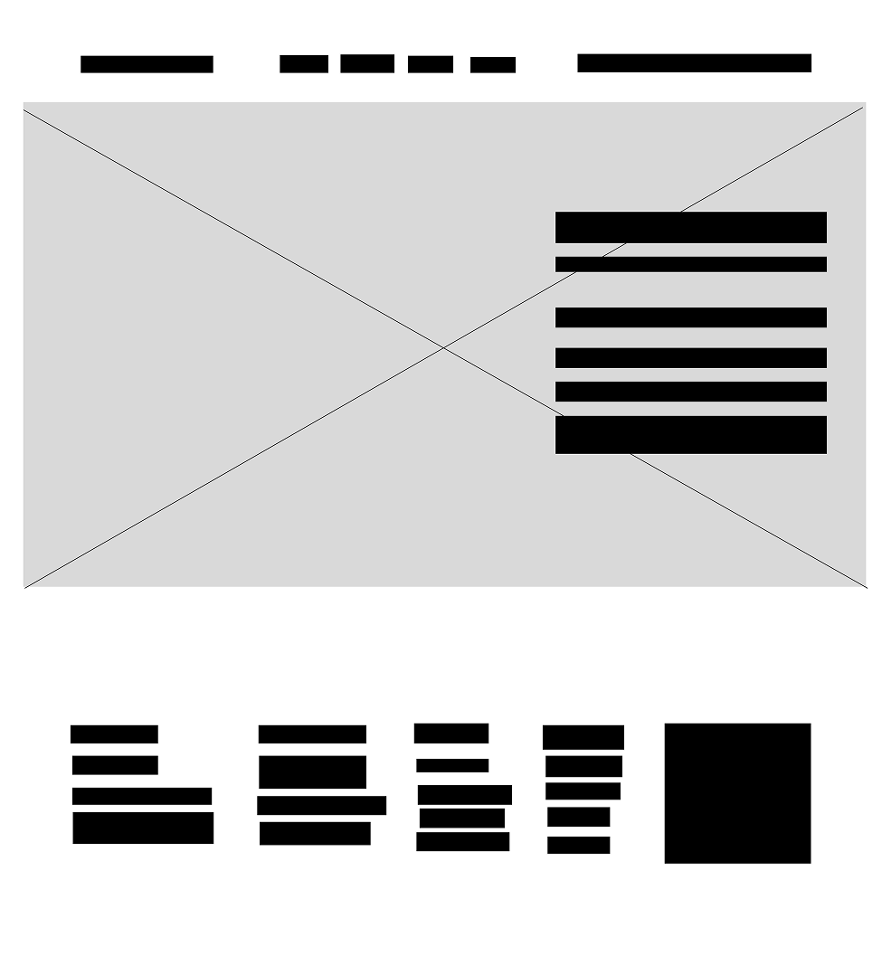
From the insights gathered during early user research, participants highlighted the need for a simpler and more organized online shopping experience. Many users mentioned that most e-commerce websites feel overwhelming — too many categories, mixed product types, and confusing navigation. Because of this, the primary goal of the low-fidelity wireframes for GlobalCart was to create a layout that feels clean, predictable, and easy to browse without confusion.
Participants also emphasized wanting faster access to essentials, such as product details, price clarity, and a quick way to compare similar items. They expressed frustration with websites that hide important information behind multiple clicks or cluttered product pages. As a result, these pain points shaped the structure of the early wireframes.
The low-fidelity designs focused especially on:
By starting with low-fidelity wireframes, the goal was to ensure users could browse products, add items to their cart, and progress toward checkout without confusion — setting a strong foundation before moving into more detailed visual design.
Design process
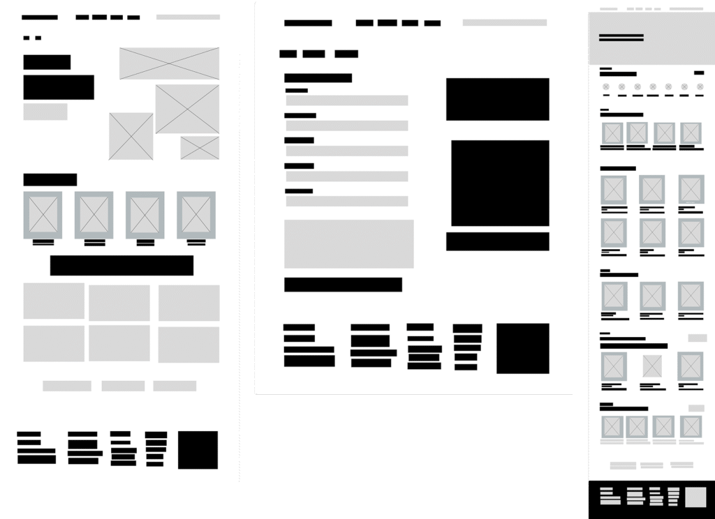
From the insights gathered during the earlier research stages, participants consistently emphasized the importance of a clear, structured, and trustworthy shopping experience. Many users mentioned that while browsing products is simple on most websites, they often struggle once they start comparing items, reviewing details, or moving toward checkout. Because of this, the mid-fidelity stage focused on refining the layout and interactions to ensure the experience remained straightforward as complexity increased.
Participants also highlighted the importance of transparency and reassurance—being able to quickly see product prices, delivery expectations, and seller information without digging through multiple screens. As a result, the mid-fidelity designs prioritized information hierarchy, ensuring the most essential details remained visible and easy to scan.
During this stage, special attention was given to:
The mid-fidelity wireframes served to validate whether the structure of GlobalCart could support real shopping behavior — helping confirm that users could browse, compare, and move smoothly into purchasing without feeling overwhelmed or lost.
Design process
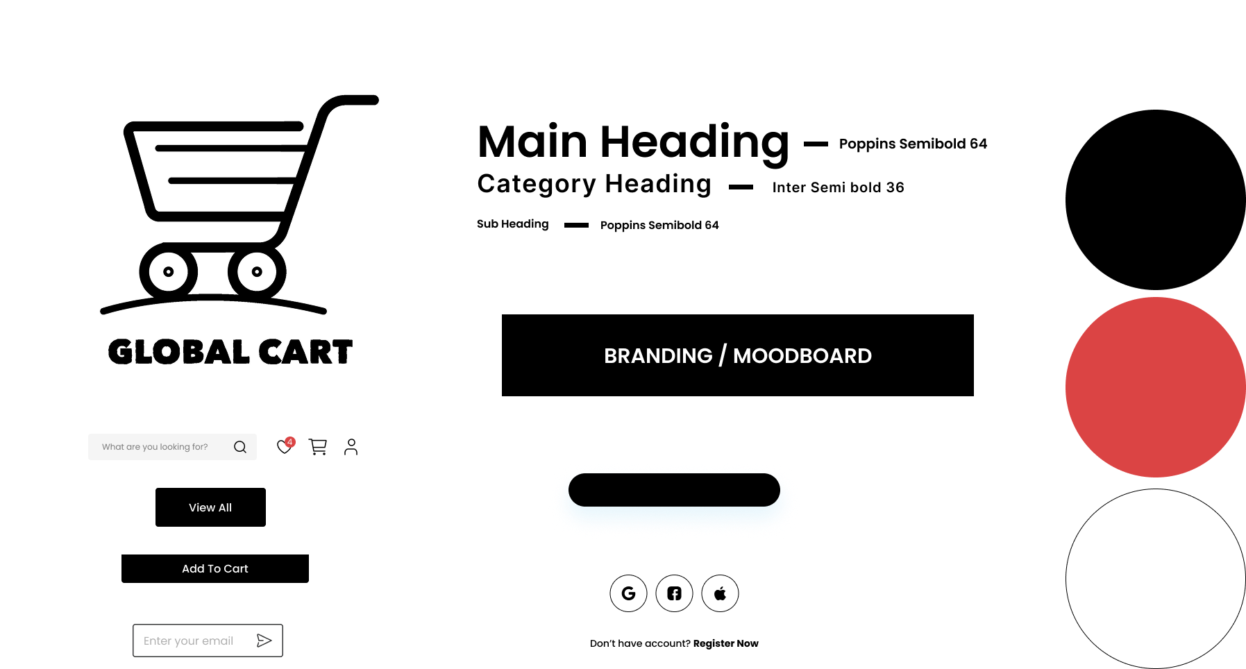
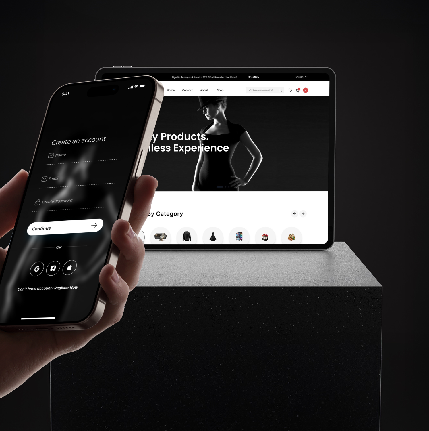
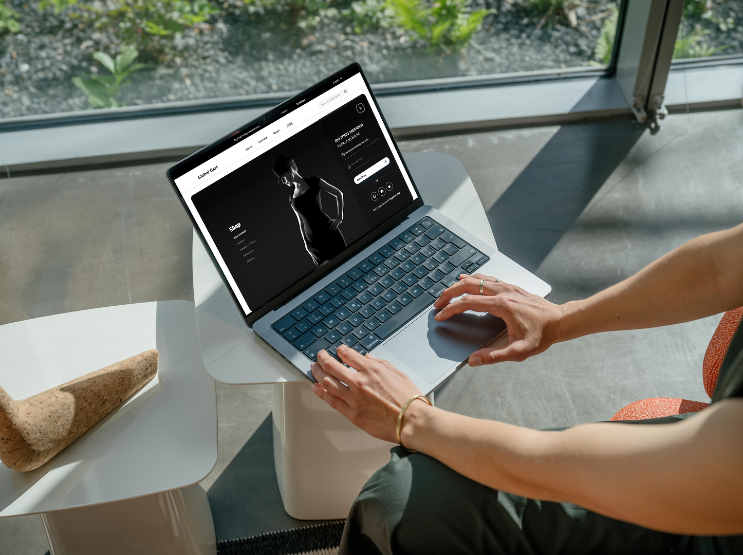
Global Cart’s branding is built around a minimal black-and-white palette, intentionally designed to communicate clarity, trust, and ease of navigation. Because online shopping already presents users with a high amount of visual information—product images, prices, variations—the brand avoids unnecessary color distractions and instead focuses on a clean shopping experience.
Color Palette:
This monochrome direction enhances product visibility, ensuring that items—not the interface—take center stage.
Design process
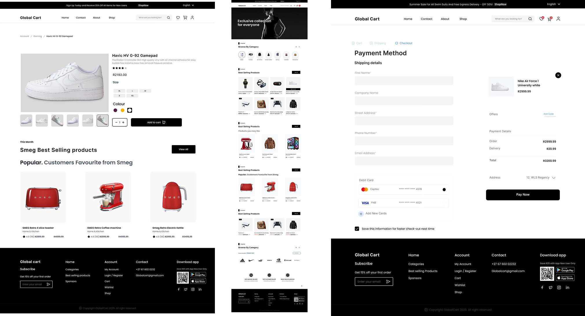
The high-fidelity stage focused on transforming the structural ideas from the mid-fi wireframes into a polished, realistic interface that users could interact with as if it were the real shopping platform. This level of detail allowed for a more accurate evaluation of visual hierarchy, spacing, accessibility, and overall brand expression.
From earlier research and feedback, users emphasized the need for a modern, trustworthy, and easy-to-scan interface—especially when browsing multiple products or reviewing order details. As a result, the high-fidelity designs focused on elevating clarity and confidence at every stage of the experience.
Key focuses during high-fi development included:
By building out a high-fidelity prototype, it became possible to test the interface under realistic conditions. This helped validate not only the visual direction but also the practical experience of navigating categories, comparing products, and completing purchases. Seeing the design at full fidelity made it easier to detect small usability issues early, ultimately strengthening the final user experience.
Design process
To evaluate the usability and clarity of the GlobalCart shopping experience, I conducted remote usability testing with participants who frequently shop online and match the behaviors of everyday e-commerce users.
Sessions were completed remotely using screen-sharing, allowing participants to navigate the prototype naturally while thinking aloud. Each session followed a structured script to ensure consistency in task timing, observation, and data collection.
All sessions were recorded and reviewed afterward to identify recurring patterns, pain points, and usability errors. A feedback grid was used to categorize insights into what worked well, what caused confusion, questions, and new opportunities. These insights were then synthesized using affinity mapping and prioritized using a severity–frequency matrix to identify the most impactful issues to address in the next design iteration.
Tested flow
Participants were asked to complete the core tasks that represent primary interactions of an e-commerce shopper:
Design process
What worked well:
What caused confusion
What users consistently appreciated
Design process
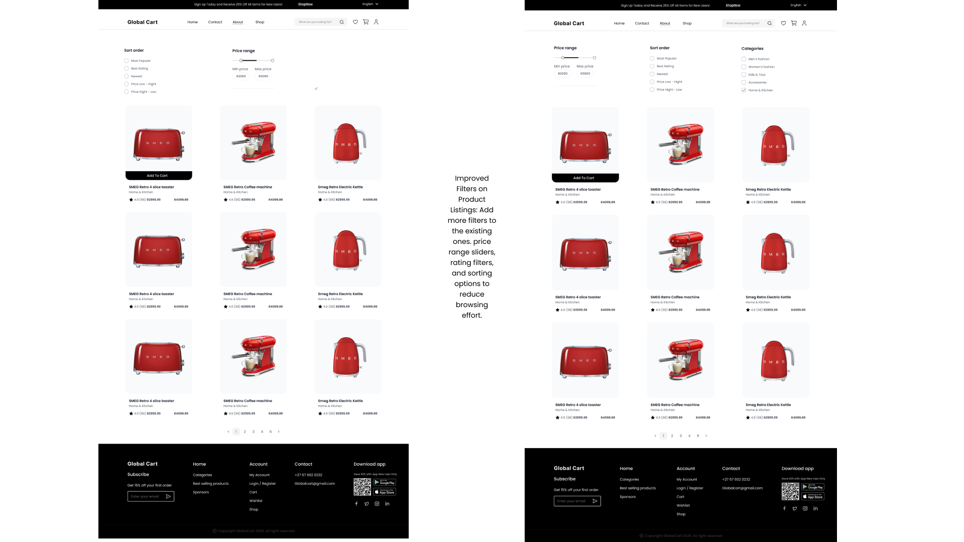
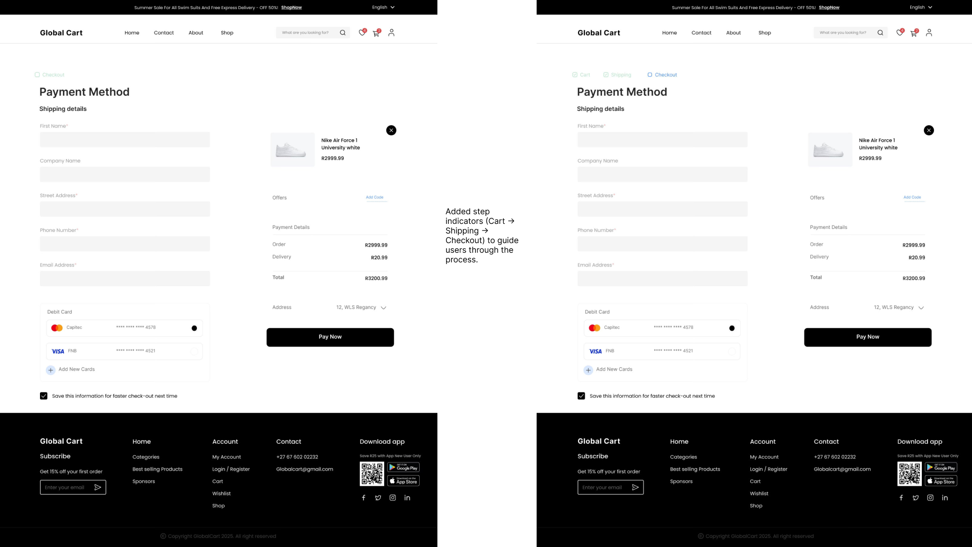
Based on the findings, several improvements were made to strengthen clarity, reduce friction, and enhance the shopping experience:

An end-to-end job application tracker that helps seekers discover, apply, and stay organized. A single platform to simplify the entire job hunt journey.
MyMoviesis an end-to-end movie companion that helps viewers discover, track, and enjoy films. A single platform to simplify the movie-watching journey.